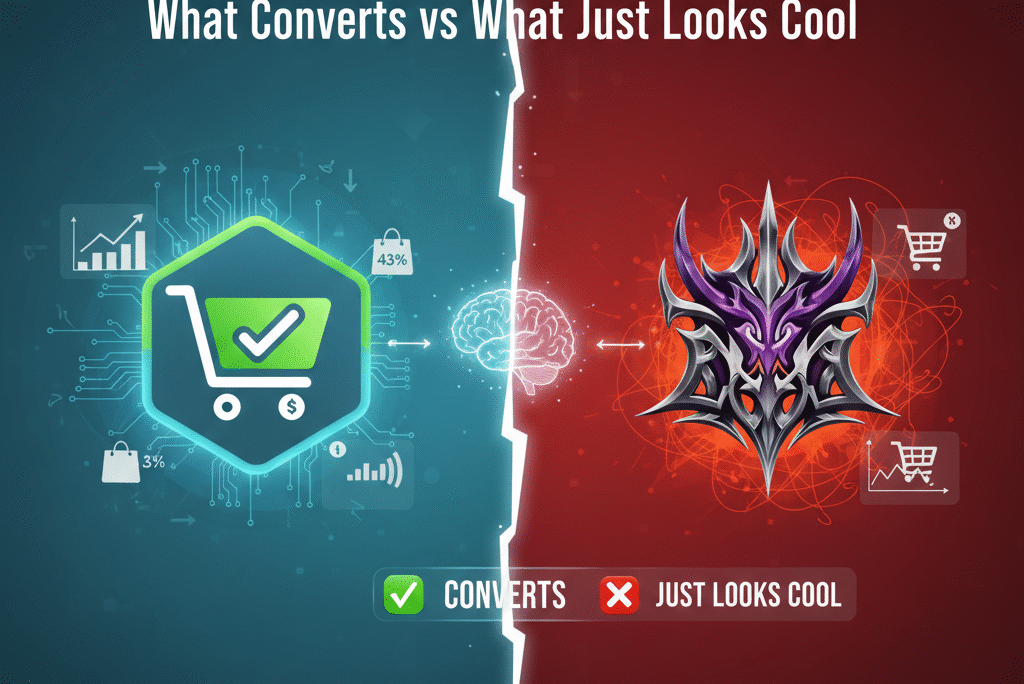
Quick Answer: A converting ecommerce logo design does three things: it signals legitimacy instantly, matches the emotional promise of the product, and works at every size — from Amazon thumbnail to packaging label. The difference between a logo that looks cool and one that actually drives trust comes down to clarity, typography fit, and whether it was designed for real marketplace environments or for a design portfolio. Most ecommerce logos fail the second test.
This is for ecommerce sellers who have a logo — maybe even one they like — and are still watching conversion rate stay stubbornly flat while wondering what’s missing. Quite often, what’s missing isn’t better ads or lower prices. It’s a brand visual that earns confidence before a single word of copy gets read.
The Thing Nobody Says About Ecommerce Logos
Scroll through Amazon, Etsy, eBay, or a hundred Shopify stores and something starts to register after a while: a significant number of these brands look fine. Clean design, modern fonts, considered color choices. Nothing obviously wrong. And yet most of them aren’t building the kind of trust that translates into strong conversion rates, repeat purchases, or the pricing power that comes from genuine brand recognition.
The product is often decent. The photography is usually competent. The copy is adequate. But something in the overall impression creates a faint hesitation — a barely-perceptible sense of “I’m not sure I know this brand” — that adds just enough friction to send a meaningful percentage of interested buyers elsewhere.
More often than sellers realize, the source of that hesitation lives in the logo. Not because the logo looks bad in any obvious way, but because it was designed to look good rather than to do a specific job — and in ecommerce, those two goals are related but not identical.
This piece is about understanding the difference: what a logo that actually earns trust in a marketplace environment needs to do, why so many ecommerce logos fail at that job while passing every conventional design quality test, and what changes when the design brief shifts from “make this look impressive” to “make buying feel safe.”
Why Logos Carry More Weight in Ecommerce Than Anywhere Else
In physical retail, a logo is one element among many that collectively build a brand impression. A customer walks into a store, handles a product, reads the packaging, talks to a staff member if they have questions, sees the overall environment, and forms their impression from all of those inputs simultaneously. The logo is part of the picture but not the whole picture.
Online, and on marketplaces especially, the logo often arrives before almost everything else. Before the product’s quality can be assessed physically, before copy has been read, before reviews have been examined, before price has been contextualized — the logo has already created an impression. And that impression determines what the buyer does next.
The impression isn’t conscious or analytical. Nobody thinks “the tracking on that wordmark suggests operational maturity” or “the kerning is slightly off, which implies a level of design investment that makes me uncertain about the brand’s standards.” The evaluation is emotional and instant. The brain asks, roughly: does this feel like a real, trustworthy business, or does it feel like something that might not deliver on its promise?
This question gets answered within seconds, based primarily on visual signals that the buyer never explicitly examines. And the logo is one of the most prominent of those signals.
In ecommerce, where every purchase from an unfamiliar brand involves some degree of trust extension — “I’m sending money to a seller I’ve never met based on photographs and text” — anything that reduces that trust is genuinely costly. Not in a theoretical brand-equity sense, but in the immediate, measurable sense of buyers who were considering a purchase and chose not to make one.
A logo that earns trust isn’t closing sales on its own. It’s removing the resistance that prevents sales from closing at the rate the product and the price would otherwise support. In conversion terms, that removal of resistance is worth more than most sellers give it credit for.
The Patterns That Make Ecommerce Logos Fail
Understanding what doesn’t work is more useful than abstract design principles, because the failure modes are recognizable and consistent enough to describe specifically.
Trend-Chasing Without Brand Fit
Every design era has its visual language, and designers working within it tend to produce work that looks current and polished in the context of that era’s conventions. Ultra-minimal sans-serif wordmarks. Abstract geometric marks that suggest concepts like precision or connectivity without depicting anything specific. Color palettes that happen to be having a moment in the design community.
These logos look good in portfolios. They photograph well for brand announcement posts. They feel familiar because they look like dozens of other brands launched in the same period — which is, from a functional standpoint, almost the opposite of useful for a brand trying to be recognized and remembered in a crowded marketplace.
The deeper problem with trend-chasing is that it prioritizes what looks credible to people who follow design closely over what communicates clearly to buyers who’ve never thought about logo design and are making purchasing decisions in seconds. A logo that impresses a designer might leave an ordinary buyer with no sense of what kind of brand they’re encountering, what the product is, or why they should feel confident choosing this over alternatives that cost less.
Over-Clever Conceptual Work
Logo design has a category of concept that is genuinely clever and genuinely useless in ecommerce: the visual pun, the hidden symbol, the negative space trick, the mark that works in two ways if you look at it carefully. These concepts are satisfying to design and satisfying to explain. The arrow hidden in the FedEx logo is genuinely elegant. But FedEx has decades of brand exposure and billions in marketing behind that logo — the cleverness is a bonus on top of an already-established identity.
For an emerging ecommerce brand with a logo that appears at thumbnail size next to a product title and a price, clever concepts typically produce one of two outcomes: the buyer misses the concept entirely and sees just a confusing or arbitrary mark, or the buyer notices something slightly off but can’t identify what it is, which registers as vague unease rather than charmed delight. Neither outcome serves conversion.
The time buyers spend appreciating conceptual elegance in a logo is essentially zero. The time they spend forming an impression that determines whether to keep looking is roughly a second. Concepts that take more than a second to land aren’t serving the function.
Personality Mismatch
This failure mode is specifically about the gap between what a logo communicates and what the product actually is — and it’s one of the fastest trust destroyers in ecommerce.
A playful, rounded, warm logo on a product that’s supposed to communicate precision and professional reliability creates dissonance. A hyper-premium, luxury-coded visual identity on a product priced at the category average creates skepticism — the buyer unconsciously registers that the brand is trying to look more expensive than the price suggests it actually is, which raises questions about what else might not be quite what it appears.
The gap doesn’t have to be dramatic to damage trust. Even a subtle mismatch — a logo that skews young and casual for a product with a middle-aged professional buyer profile, or a logo that suggests mass-market volume for a product trying to position as artisanal — creates a slight friction that the buyer experiences as unease without being able to identify its source.
The buyer’s experience of personality mismatch is almost always described as the product rather than the logo. “Something felt off about that brand” doesn’t get articulated as “the logo’s visual personality was inconsistent with the product category’s trust signals.” It just becomes a conversion that didn’t happen.
Scale Blindness
This is the most purely practical failure mode, and it’s surprisingly common. A logo is designed and approved based on how it looks at the dimensions where it’s first seen — typically a large mockup, a logo presentation slide, a brand identity document. It looks excellent. The detail is considered, the proportions are refined, the overall impression is strong.
Then it gets applied to the environments where it actually operates in ecommerce: a 32-pixel favicon in a browser tab, a small shop icon on Etsy, an Amazon storefront logo at whatever dimensions Amazon displays it, a repeat print on packaging material. At these sizes, the detail that made the logo look considered at large dimensions becomes visual noise, fine lines merge or disappear, and what reads as sophisticated at full size reads as confused at thumbnail size.
The environments where ecommerce logos operate are overwhelmingly small environments. Mobile screens, marketplace thumbnails, packaging labels, social media profile images — all of these constrain the logo to dimensions where only the most essential forms survive intact. A logo that wasn’t tested and refined specifically for these dimensions will look progressively worse as it gets smaller, creating exactly the impression of amateur inadequacy that the brand was trying to avoid.
What a Converting Ecommerce Logo Actually Does
Having covered the failure modes, the positive picture becomes clearer. A converting ecommerce logo doesn’t try to win design awards or communicate brand complexity in a single mark. It accomplishes something much simpler and, in practice, much more difficult: it answers three questions, instantly and unconsciously, every time a buyer encounters it.
The first question is legitimacy: does this look like a real, established business? Brands that look assembled or temporary — that feel like they were launched last week or might disappear next month — don’t get the benefit of the doubt that established-feeling brands get. Buyers extend trust to brands that feel stable, and visual stability is something a good logo communicates directly.
The second question is category fit: does this brand feel right for this product? The logo’s visual personality should match the emotional register of the product category — not in a generic or forced way, but in a way that feels natural, as if this brand genuinely belongs in this space.
The third question is purchase safety: does this feel like something I can trust with my money? This is the most loaded of the three questions and the least consciously examined, but it’s the one that most directly determines conversion. Buyers who feel uncertain about a brand, even without being able to articulate why, find reasons not to purchase. Buyers who feel confident purchase and often don’t closely examine why they felt confident.
The logo’s job is to contribute to positive answers to all three questions, quickly and without requiring the buyer to do any conscious evaluative work. Everything else in a logo — how interesting it looks, how creative the concept is, how current the aesthetic is — is secondary to these three functions.
Typography: The Most Underestimated Element
If there’s a single design element that consistently makes the largest difference between ecommerce logos that convert and ones that don’t, it’s typography — and specifically whether the typography was chosen because it fits the brand’s personality and buyer expectations, or because it happened to look good to the person making the decision.
Fonts carry personality in ways that operate below conscious awareness. A sharp, geometric sans-serif communicates modernity, precision, and a certain kind of forward-looking confidence. Rounded sans-serifs feel accessible, friendly, and low-intimidation. Traditional serif typefaces carry associations with established authority, quality over time, and a kind of permanence. Script fonts introduce a personal, handcrafted quality. Heavy, condensed fonts communicate strength and intensity.
None of these is inherently better for ecommerce logos. What matters is whether the font’s personality matches what the buyer needs to feel about the product in order to purchase it confidently.
A supplement brand needs to communicate trustworthiness and cleanliness — a clean, precise sans-serif, used with sufficient restraint to feel medical-adjacent rather than pharmaceutical-clinical, tends to work. A home decor brand needs to communicate taste and warmth — a serif with considered weight variation, or a humanist sans-serif, often fits better than something geometric and cold. A tools or equipment brand needs to communicate reliability and capability — something with weight and clarity, not something that looks like it was designed for a tech startup.
The mistake is choosing a typeface because it’s current, because it was used by a successful brand in a completely different category, or because the person making the choice personally finds it attractive without asking whether it fits the specific buyer’s specific expectations for this specific product type.
This mismatch is behind many of the “something feels off” impressions that buyers experience but can’t articulate — the logo looks professionally executed but something about it is slightly inconsistent with what the product category usually feels like, and that inconsistency creates doubt where confidence should be.
Color Psychology: Real but Often Misapplied
Color choices in logo design occupy a strange position in ecommerce brand discourse — simultaneously overstated (as if specific colors cause specific purchase behaviors in predictable ways) and underapplied (as if the only thing that matters about color is personal preference).
The reality is somewhere between these extremes. Colors don’t hypnotize buyers into purchasing, but they do carry associations — cultural, contextual, and broadly consistent enough to be strategically significant.
Research on color in marketing from MIT confirms that color associations are real and measurable in their effects on brand perception — while also showing that context and category expectation shape those effects significantly, which is why the same color can signal premium quality in one product category and low value in another.
Black and gold together carry premium associations that are nearly universal in the contexts where they appear. Blue across many categories conveys dependability and reduces the anxiety around unfamiliar purchases. Green in health and food contexts signals natural, clean, and trustworthy. Red commands attention and can create urgency but risks feeling aggressive or low-quality if applied without care.
The more strategically important insight about color in ecommerce logos is about category coherence rather than individual color psychology. Every established product category has a visual language — a set of colors and aesthetics that the successful brands in that category have converged around over time. That convergence isn’t arbitrary: it reflects the colors that communicate the right associations for that category’s buyers.
A brand that shows up in a category with a color palette dramatically different from everything else isn’t necessarily going to stand out as bold and memorable. It may stand out as out-of-place and suspicious — because it looks like a brand that doesn’t belong in this category, and brands that don’t belong tend to be ones that aren’t deeply invested in it.
The strategic approach to color for converting ecommerce logos is to understand the visual language of the specific category and work within it with enough differentiation to be recognizable without enough departure to feel alien. This isn’t about lacking creativity — it’s about directing creativity toward the question that actually matters for conversion, which is what colors make buyers feel safe and confident in this specific category, not which colors look interesting in the abstract.
The Simplicity Principle: Discipline, Not Laziness
The word “simple” in logo design is sometimes heard as code for “not very creative” or “not much work.” In ecommerce logo design specifically, simplicity is neither of those things — it’s a response to a genuine and unforgiving set of practical requirements.
An ecommerce logo needs to work in all of the following environments simultaneously: the product’s packaging, which may be small and may involve print processes that don’t reproduce fine detail reliably. The marketplace listing’s storefront area, where logos appear at dimensions determined by the platform rather than the brand. Social media profile images, which constrain logos to small squares. Favicons, which are 16 pixels wide. Email headers. Hang tags. The side of a mailer. A watermark on product photography.
A logo with fine detail, multiple colors that need to be precisely reproduced, or elements that only work when sufficient space allows them to breathe will fail some or most of these environments. Not catastrophically — it won’t become unrecognizable — but it will look slightly off, slightly amateur, slightly like something that doesn’t quite belong in a professional context. That “slightly” matters, accumulated across every touchpoint where the brand makes an impression.
A simple logo — clear forms, minimal elements, a limited color set that reproduces reliably across print and screen — survives all of these environments and looks consistent and intentional in all of them. The consistency itself is a trust signal. A brand that looks the same everywhere, from the large version of the logo on a website header to the tiny version on a packaging label, feels established in a way that a brand with a logo that degrades at small sizes doesn’t.
This is why simplicity in ecommerce logo design is strategic rather than stylistic. The discipline required to produce a logo that works everywhere while still having a clear personality and looking considered is genuinely significant. It’s not a starting point — it’s an achievement.
Consistency: Where the Logo’s Value Multiplies
A logo’s conversion value doesn’t come from the logo in isolation — it comes from the logo as the anchor of a consistent visual system that extends across every touchpoint where a buyer encounters the brand.
The compounding effect works like this: a buyer who encounters the brand first through an Amazon listing, then sees the product’s packaging when it arrives, then looks up the brand and finds a website and a social media presence, is forming a cumulative impression across all of those touchpoints. If the visual identity — the logo, the colors, the typography, the overall aesthetic — is consistent across all of them, the cumulative impression is of a single, coherent, intentional entity. That impression generates the trust and familiarity that makes the buyer significantly more likely to purchase again, to recommend the brand, and to be patient with minor imperfections.
If the visual identity is inconsistent — if the logo that appears on Amazon looks different from the one on the packaging, which looks different from the website, which has different fonts from the social media — the cumulative impression is of something assembled rather than designed. Not necessarily untrustworthy in an explicit way, but vaguely unreliable in the way that things without coherent identity often feel.
The logo can only do its trust-building work if it’s the consistent anchor of an identity rather than a standalone element. This is why the most important decision in ecommerce logo design isn’t the logo itself — it’s the commitment to treating the logo as the starting point of a visual system that gets applied consistently, rather than as a completed task that can be revisited if and when there’s time.
What Marketplace Environments Specifically Require
Amazon, eBay, and Etsy each impose specific constraints on how brand identity gets presented, and logos designed without these constraints in mind tend to underperform in each of these environments.
On Amazon, the brand logo appears in the storefront header, in A+ content, and sometimes in brand story modules — but the brand’s visual identity is primarily communicated through the product photography rather than through prominent logo display. This means the logo needs to be clean enough to work in relatively small placements, but more importantly, it needs to set the visual tone for photography and brand assets that carry most of the identity work in the actual listing environment.
On Etsy, the shop icon is a primary brand touchpoint — it appears in search results, in the shop header, and wherever the shop is referenced across the platform. This icon is typically small, circular or square, and needs to immediately communicate something meaningful about the brand’s personality. A logo that requires significant space to work, or whose detail gets lost at icon size, fails at Etsy’s most important brand placement. The personality that works on Etsy — warm, artisanal, aesthetic, intentional — also needs to show up in the icon, not just in the full-size logo.
On eBay, the visual environment is more utilitarian than either Amazon or Etsy, and a logo that looks very premium or very edgy can feel out of place in a way that damages rather than builds credibility. The logos that work best on eBay tend to be clear, professional, and fairly neutral in their aesthetic — present enough to establish a brand identity without creating visual tension against the platform’s own interface.
These platform-specific considerations mean that the most effective ecommerce logo design process involves explicitly testing logo concepts in the actual environments where they’ll appear — checking how the mark reads as a small Etsy shop icon, how it looks in an Amazon brand header, how the colors reproduce in eBay’s interface — rather than approving a logo based solely on how it looks in the design presentation.
The Brief That Produces Logos That Convert
Everything described above points toward a different kind of brief than the one most ecommerce sellers give when they commission a logo. The typical brief focuses on aesthetic direction: “I want something modern and clean” or “I want it to feel premium” or “here are some logos I like.” These are starting points but they don’t address the questions that determine whether a logo will actually earn trust in a marketplace environment.
A brief that produces converting logos tends to be organized around function rather than aesthetics. It starts with the buyer: who are they, what does buying from this brand need to feel like for them to proceed confidently, what associations do the successful brands in this category consistently carry? It describes the product’s position: is this a premium, mid-range, or value brand, and what does that mean for how the logo should signal price expectations? It specifies the environments where the logo will operate: Amazon, Etsy, packaging, social media — what are the size constraints and how will the logo need to work at those sizes?
From this foundation, aesthetic decisions — typeface personality, color choice, mark style — become responses to functional requirements rather than expressions of arbitrary preference. The logo that results from this process may not be the most exciting logo that could have been designed. It will be a logo that consistently does its job of earning confidence before the buyer has read a word about the product — which is, ultimately, the job that matters.
Frequently Asked Questions About Ecommerce Logo Design
How much should an ecommerce brand spend on logo design?
The range is genuinely wide, and price doesn’t reliably correlate with how well a logo converts. What correlates more reliably is whether the design process was oriented toward the functional questions described in this guide — buyer psychology, category fit, scale requirements, marketplace environments — rather than purely toward aesthetic quality in isolation. A modest investment in a process that asks the right questions will consistently outperform a large investment in a process that produces beautiful work without addressing the specific needs of the ecommerce context.
How often should an ecommerce logo be updated?
The general guidance is to evolve deliberately rather than frequently. Frequent logo changes reset the recognition capital that builds over time and that represents a significant portion of a logo’s conversion value. The trigger for a logo update should be substantive — a meaningful shift in brand positioning, a target audience change, entry into a new market where the current identity doesn’t work — rather than aesthetic boredom or a sense that something more current is available.
Should the logo include a symbol or just a wordmark?
Either can work in ecommerce contexts. Wordmarks are often more practical for brands early in their development, before enough recognition exists for a symbol to carry meaning independently. Symbol-plus-wordmark combinations are versatile and allow for a symbol-only version once recognition is established. The choice matters less than whether the chosen format works at the sizes and in the contexts the brand actually operates in.
Does an ecommerce logo need to be unique and ownable?
Yes, but “unique” in the most useful sense means immediately identifiable as belonging to this brand rather than any other, not maximally different from every other logo in existence. A logo that looks like it could belong to several other brands in the same category is not doing its recognition work. A logo that looks unmistakably like this specific brand, even within a visual language familiar to the category, is ownable and valuable.
What’s the single most common logo mistake ecommerce sellers make?
Approving a logo based on how it looks at the size it was presented rather than at the sizes it will actually operate at. Testing a logo at Etsy shop icon dimensions, at Amazon storefront dimensions, at packaging label size, and at favicon size before final approval would prevent a significant proportion of ecommerce logo failures, because most of the functional problems become immediately visible at those sizes.
Final Thought: Silent Salespeople Don’t Shout
A logo’s contribution to ecommerce conversion is quiet and accumulative. It doesn’t close sales. It removes resistance. It answers unconscious questions before they become conscious doubts. It tells buyers, in the fraction of a second before they’ve examined anything else, whether to keep looking or to move on.
A logo designed to look impressive does this inconsistently, because impressiveness and trust aren’t the same thing, and a buyer who is impressed by a logo they find attractive hasn’t necessarily been made to feel confident about purchasing. A logo designed to earn trust does this consistently, because every element — the clarity of the forms, the fit of the typography, the category-appropriate color choices, the ability to survive at small sizes — is in service of the specific, practical function of making buying feel safe.
The best ecommerce logos look good, feel right, and then get out of the way. They don’t ask to be admired. They don’t require explanation. They simply make the brand feel like something worth choosing — and then leave the rest of the conversion to the product, the price, and the copy that do the explaining.
If your logo is working against that function — if it’s creating confusion, mismatch, or hesitation anywhere in the buyer’s experience — it’s worth addressing with the same seriousness you’d bring to a product quality problem or an advertising efficiency problem, because the impact on conversion rate is comparable.
If you want your logo and visual identity built around these principles, designed for real marketplace environments and real buyer psychology rather than for portfolio presentations, you can explore how we approach brand identity at ecommate.co.uk.