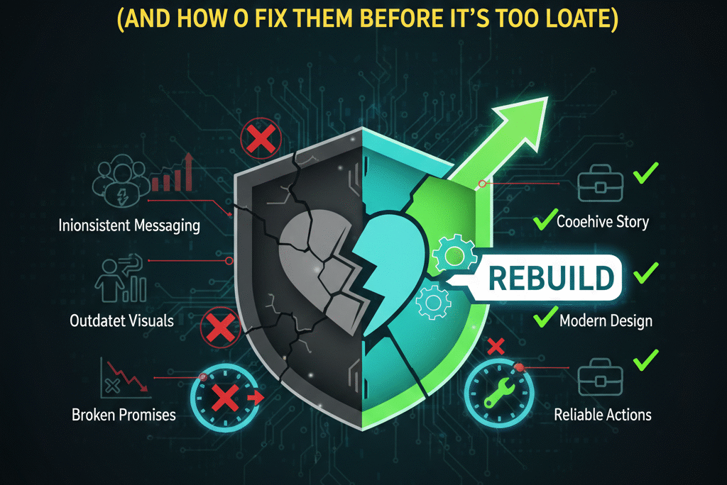
Quick Answer: The brand identity mistakes that most damage customer trust are inconsistency across platforms, visual signals that suggest low quality, no distinct brand personality, overcomplicated logos, and the absence of visible social proof. These mistakes don’t generate complaints — they generate silent exits. Research shows that buyers form trust judgements about a brand in under 50 milliseconds, meaning the visual and identity signals your brand sends are processed and acted upon before a single word is read. In 2026, brand identity is not a design exercise — it’s a conversion variable.
Why Customer Trust Breaks Faster Than It Used to Build
There’s a mental model most business owners carry about trust: it builds gradually, over time, through repeated positive interactions. And that was true, once. In a world of local businesses, word-of-mouth referrals, and limited competition, trust accumulated slowly and lasted a long time.
The ecommerce era changed the mechanics entirely.
A potential customer finds your brand today — through a search result, a social media ad, a product listing, a friend’s recommendation. They land on your website, see your logo, scan your visual presentation, skim your copy, and make a provisional trust decision in a matter of seconds. Not minutes. Seconds. Research from MIT suggests the human brain processes visual information in as little as 13 milliseconds. Studies on website trust formation consistently show that design-based trust or distrust is established in under 50 milliseconds — before the user has consciously registered what they’re looking at.
The quiet question their brain asks in that window isn’t complicated: Is this legit, or am I going to regret this?
Brand identity is what answers that question — before your product quality does, before your customer service does, before your pricing does. The visual signals, the consistency, the professionalism, the tone — all of it is communicating before a word of your copy is absorbed. And when that visual communication gives the wrong answer, the customer leaves. No feedback. No complaint. Just a closed tab and a conversion that will never happen.
This guide covers the ten brand identity mistakes that trigger that silent exit most often — why each one damages trust specifically, and what fixing it actually looks like in practice.
Mistake #1: Looking Like Everyone Else — The Template Trap
You’ve seen this brand. Generic sans-serif logo in dark blue or black. Stock photography of people in professional environments looking pleased with generic outcomes. A colour palette pulled from the nearest free brand template. Homepage copy that could have been written by a committee that feared taking a position on anything.
The intuition behind this approach is understandable: familiarity feels safe. If the brand looks like other established brands in the category, maybe customers will extend the same trust. This is a logical idea that produces the opposite result in practice.
Familiarity only builds trust when the customer already has a positive association with what’s familiar. Generic-familiar — a brand that looks like a bland aggregate of every other brand in the category — doesn’t trigger positive association. It triggers the feeling that this brand has no distinct identity, which the customer’s brain translates as: no one thought carefully about this. And a brand that wasn’t thought about carefully creates anxiety about whether the product or service was thought about carefully.
There’s a deeper mechanism at work here too. When a brand is visually interchangeable with its competitors, it removes the possibility of meaningful comparison. The customer has no visual or identity differentiator to attach to. So they do what they do with all undifferentiated options: they compare on price. And competing on price is a race to the bottom that neither the seller nor the market benefits from.
Humans trust specificity. A brand that makes specific visual choices — a distinctive colour that isn’t what everyone else in the category uses, a logo mark with a clear rationale, a tone of voice that takes a position — signals that someone thought intentionally about what this brand is and who it’s for. That intentionality communicates competence. Competence is what trust is built on.
The fix: You don’t need to be unconventional or loud. You need to be recognisable. That distinction matters. Recognisability comes from consistency and deliberate choice — a specific colour combination that belongs to you, a logo that captures something about your positioning rather than your industry category, a visual tone that is yours rather than the category’s default. The benchmark isn’t originality for its own sake. The benchmark is: could a customer identify this as your brand after seeing it twice?
Mistake #2: Inconsistent Visuals Across Platforms
This mistake is ubiquitous and its effects are regularly underestimated.
Your Instagram feed looks current and professional. Your website design is two or three years behind it. Your email signature is using a different logo version from what’s on the site. Your proposal documents have a colour scheme that doesn’t quite match anything else. Your social media profile images use a different cropped version of the logo from your packaging.
Each individual inconsistency seems minor in isolation. The customer who encounters all of them across multiple touchpoints doesn’t consciously catalogue each discrepancy — but their brain accumulates the impressions. And what that accumulation signals is disorganisation. A brand that isn’t coherent in its own presentation suggests operational incoherence more broadly. If they can’t maintain a consistent logo across their own platforms, what does that imply about their attention to consistency in their product or service?
This psychological transfer is not rational, but it’s reliable. Consistency in presentation signals that there are systems in place, that someone is paying attention, that the brand is being managed rather than improvised. And managed, attentive operations feel safer to trust money with.
Strong brands feel like a unified entity regardless of where you encounter them. The Instagram, the website, the email, the packaging, the invoice — same colour palette, same typography, same logo in its correct proportions, same visual tone. The experience of encountering the brand anywhere produces the same feeling as encountering it everywhere else. That coherence is not accidental — it’s the result of having a defined brand system rather than a collection of design assets created at different moments by different people.
The fix: A brand guide is the practical output here — not a lengthy document that nobody reads, but a working reference that defines the non-negotiables: exact colour values in HEX, RGB, and CMYK; specific font names and weights for headings, body copy, and captions; logo versions and their correct usage contexts (primary, reversed, icon-only); rules for photography and imagery style. Then — critically — actually apply it consistently. Audit every touchpoint once a year: website, social profiles, email signatures, documents, packaging, ads. Inconsistency is usually the result of different assets being created at different times without reference to a shared standard. The standard solves it.
Mistake #3: A Logo That Works Too Hard and Communicates Too Little
The impulse behind overcomplicated logos is generous: the brand wants to convey everything it stands for in a single mark. The values. The mission. The product. The feeling. The ambition. All at once, in one icon.
The result is almost always a logo that communicates none of those things clearly, because the human eye can only process so much in a glance, and a logo is a glance-level communication tool.
Icons within icons. Multiple interlocking meanings that require explanation. Abstract geometric shapes with a narrative that only the designer who created them can articulate. Gradients and shadows that look impressive in the design presentation and become illegible at 32 pixels. Wordmarks with so many custom letterforms that the name itself becomes hard to read.
The overcomplicated logo creates a specific type of trust problem: it feels insecure. A brand that tries this hard to say everything at once is a brand that doesn’t quite know what it is yet. Confidence, visually, is expressed through restraint. The brands with the most trust equity in the world — the ones customers return to without re-evaluating — tend to have logos that are simple to the point of seeming obvious. That simplicity is deliberate. It communicates: we know exactly what we are, and we don’t need to explain it.
A further practical problem: complicated logos break down across contexts. A logo that looks impressive at full size in a brand presentation becomes a smudge in a social media profile picture. It disappears as a favicon. It becomes unreadable on packaging. Every context where the logo doesn’t read clearly is a missed trust signal — a moment where the brand fails to be identified and recognised.
The fix: Test your logo at 32 pixels square, in black on white, and on a coloured background. Those three tests eliminate most overcomplicated designs immediately. A logo that passes all three can be used everywhere without compromise. Aim for a mark that identifies the brand clearly and confidently — not one that explains it. If someone needs to ask what the logo means, the logo isn’t ready.
Mistake #4: Visual Signals That Say “Cut Corners”
This is the mistake that hurts most because it’s so common among businesses whose product and service quality are genuinely strong.
Pixelated images that were exported at the wrong resolution. Fonts that weren’t purchased properly and are displaying slightly incorrectly. Spacing between elements that looks like it was eyeballed rather than measured. Colour inconsistencies between print materials and digital ones. A layout that achieves everything it needed to accomplish but feels slightly off, slightly cramped, slightly unpolished.
None of these are catastrophic in isolation. Collectively, they produce a strong signal: the person or team responsible for this brand doesn’t attend to details carefully. And customers who are deciding whether to trust a business with their money extend that signal to the business as a whole. If the brand’s presentation corners were cut, the product’s quality corners were probably cut too. The pricing doesn’t reflect real value. The service won’t be reliable.
This signal operates below the level of conscious evaluation. The customer may not be able to articulate specifically what bothers them about the brand. They just feel a subtle unease — a hesitation — that prevents them from converting. They close the tab without knowing exactly why, and the business loses a sale to a design decision that would have cost a few hundred pounds to get right.
The compounding problem is that this dynamic is most damaging precisely when a business is growing and raising its prices. An early-stage business selling at entry-level price points has some tolerance for rough-around-the-edges branding because customers adjust their expectations to the price point. A business moving upmarket — charging professional service fees, competing with established brands — will be held to a visual standard that its legacy DIY branding doesn’t meet. The brand that worked at £300 is actively undermining conversions at £1,200.
The fix: Professional design is not an expense to be deferred until revenue justifies it. It’s an investment that changes what revenue is possible. Clean typography, intentional spacing, correct image resolution across every format, colour consistency between digital and physical materials — these aren’t extravagances. They’re table stakes for a brand at any price point above entry level. If budget is constrained, prioritise the highest-visibility touchpoints first: website, social media presence, main logo, and primary marketing materials. Get those right before expanding into additional collateral.
Mistake #5: A Brand That Has No Personality or Distinct Voice
Brand voice is the most frequently overlooked element of brand identity, and it does as much work as the visual identity — sometimes more.
A brand without personality sounds like it was written by a committee that reviewed every draft for anything that might be slightly too specific, slightly too direct, or slightly too human. The result is copy that uses words but communicates nothing distinctively: “we deliver high-quality solutions to businesses looking to grow.” Every word is technically accurate. No specific brand could be identified from that sentence. It could be anyone, which means it is effectively no one.
The trust problem this creates is subtle but real. Vague language registers as evasive. When a brand can’t or won’t say anything specific about what it does, who it does it for, or what its point of view is, the customer senses the evasiveness — even without being able to name it. It feels like the brand is hiding behind generic language to avoid accountability. Real businesses that are confident in what they deliver are specific about it. Evasiveness suggests uncertainty.
Personality, on the other hand, signals humanity. And humans trust humans — or at least brands that feel human. A brand with a distinct voice — one that is direct, or warm, or wry, or educational, or rigorous — creates a relationship dynamic. The customer knows what they’re dealing with. They can make a judgement about whether they like and trust this brand’s perspective, which is a more durable form of engagement than neutrally acknowledging its existence.
Personality also creates differentiation in categories where the underlying service offering is broadly similar. Two web design agencies offering comparable services at comparable prices will not be evaluated the same way if one has a clear, confident, specific brand voice and the other sounds like every other agency website. The specific one is easier to remember, easier to recommend, and easier to return to.
The fix: Define the brand’s voice with the same rigour you’d apply to its visual identity. Not a list of adjectives — “innovative,” “trustworthy,” “customer-focused” — because those words describe every brand and no brand specifically. Instead: how does the brand speak to a customer who is confused about something? How does it handle a complaint? How does it announce a new product? What’s the tone of a follow-up email? Write three or four real examples and use them as the reference point for everything produced under the brand name.
Mistake #6: Overpromising Visually Without Backing It Up
When the brand’s visual presentation makes a promise that the actual experience doesn’t fulfil, trust collapses at the moment of fulfilment — and collapsed trust at that moment is far more damaging than weak branding at the awareness stage.
A premium, luxury-signalling visual identity — rich photography, high-end typography, aspirational lifestyle imagery — sets an expectation in the customer’s mind. They anticipate a premium experience at every touchpoint that follows: the first email after purchase, the product packaging that arrives, the customer service interaction when they have a question, the quality of the product itself. When any one of those touchpoints significantly undershoots the expectation the brand set, the customer experiences a specific type of disappointment: they feel misled. Not just let down — deceived.
The emotional response to feeling deceived is more severe and more lasting than the emotional response to simply encountering a brand that was upfront about being entry-level. A customer who bought from a premium-presenting brand and received a mediocre experience will review that experience as a betrayal. They’ll leave negative reviews. They’ll tell their networks. They’ll contest charges. The mismatch between brand promise and brand delivery is a conversion problem, a retention problem, and a reputation problem simultaneously.
This mistake also works in reverse, though less damagingly: a brand that delivers exceptional quality but presents itself as modest or entry-level misses the pricing and positioning opportunity its product quality justifies. Under-promising and over-delivering feels virtuous, but it also caps the prices you can charge and the customers you can attract.
The fix: Your visual identity should accurately represent where the business is right now, with a slight lean toward where it’s headed. Don’t present as ultra-premium if the product is solidly mid-market. Don’t present as budget if your product commands a premium. The goal is alignment — visual signals that create accurate expectations, which are then met or exceeded consistently. As the product and service quality improves, let the branding evolve to reflect it. Gradual visual elevation, aligned with actual improvement, builds authentic trust. Sudden visual aspiration, disconnected from what’s actually delivered, destroys it.
Mistake #7: Treating All Platforms and Contexts as Interchangeable
Context shapes interpretation. The same brand element that reads as sophisticated and trustworthy on one platform can read as cold, inaccessible, or irrelevant on another. Brands that ignore this dynamic often extend what works on one platform uniformly across all others, and are confused when some channels underperform.
The visual and tonal standards on LinkedIn — where professional credibility, authority signals, and business-specific language build trust — are different from those on Instagram, where authenticity, visual storytelling, and personality are the primary trust builders. The standards on Amazon — where listing quality, review visibility, and competitive pricing are the dominant conversion factors — are different from a direct-to-consumer website, where brand storytelling and customer experience carry more weight. Applying LinkedIn’s visual formality to Instagram makes a brand look stiff and unapproachable. Applying Instagram’s informality to a B2B proposal makes a brand look insufficiently serious.
Cultural context matters too. Colour associations, language conventions, pricing signals, and visual trust codes are not universal. A colour palette that signals luxury in the UK market might signal something completely different in Southeast Asian markets. Directness in copy that reads as confident to US customers might read as aggressive to UK ones, and vice versa. International brands that export their domestic brand voice and visual codes without adaptation often trigger subtle unease in markets where those codes don’t land the way they were intended.
The fix: Establish a clear distinction between brand identity and brand expression. The core identity — the values, the positioning, the fundamental visual system — stays constant across all platforms and markets. The expression adapts: the image content, the copy tone, the content format, the cultural references. This isn’t inconsistency — it’s contextual intelligence. The brand remains recognisably itself while demonstrating that it understands and respects the specific audience it’s speaking to in each environment. That understanding is itself a trust signal.
Mistake #8: No Social Proof Integrated Into the Brand Presentation
Trust has always loved evidence. It loves it more now than it ever has, because the baseline suspicion that buyers bring to brands they don’t already know has risen significantly as online fraud, misleading advertising, and disappointment from online purchases have become common experiences.
Modern buyers don’t take claims at face value. They look for independent confirmation: reviews from people who have no relationship with the brand, case studies that demonstrate results rather than just promise them, client names and logos that can be verified, certifications that have external accountability. If a brand makes claims about its quality without any visible evidence to support them, the customer has to decide how much of the implicit risk to accept. Most won’t accept it. They’ll find a competitor that has reduced the risk by providing evidence.
The mistake most businesses make is treating social proof as a separate marketing activity rather than as an integrated component of the brand identity itself. Reviews are collected but not displayed prominently. Case studies exist but are buried in a menu that most visitors never reach. Credentials are mentioned in the “about” section but don’t appear anywhere in the conversion flow. The result is that a potential customer who is evaluating the brand at its most trust-critical moment — the moment of purchase decision — doesn’t encounter the social proof that would have resolved their hesitation.
The fix: Design social proof into the brand experience rather than adding it as an afterthought. Testimonials near calls to action. Client results in hero sections rather than case study pages. Review counts prominently displayed on product pages rather than accessible only after scrolling. Trust badges and certifications where payment decisions are made, not just on the homepage. The goal is to ensure that a visitor moving through the natural conversion flow encounters trust evidence at every significant decision point — without having to seek it out.
Mistake #9: A Brand That Has Outgrown Its Origins
Most businesses that reach a certain level of growth are carrying branding that belongs to an earlier version of themselves.
The logo was designed on Canva when the business launched, or by a freelancer hired for a small budget when the idea was still unproven. The colour palette was chosen quickly because decisions needed to be made and it seemed fine at the time. The website was built to get something live rather than to represent the business at its best. In the early stage, these decisions were appropriate — the business didn’t have the revenue to justify extensive brand investment, and the priority was getting the product or service proven in the market.
The problem is that the brand remains static while the business evolves. Prices rise. The customer becomes more sophisticated. Competitors invest in their own brand identities. The gap between what the brand visually communicates and where the business actually is widens, and the legacy branding becomes an active drag on the conversion metrics that matter. Prospective clients compare the business against competitors at its current price point — not at the entry-level price point where the branding was appropriate. The mismatch becomes visible.
There’s also an internal cost to this misalignment. A team operating under a brand they’ve outgrown — one that doesn’t reflect what the business has become or where it’s heading — loses some of the energy and pride that strong brand identity creates. How a brand looks affects how the people who represent it feel about representing it, which affects everything from sales conversations to customer service interactions.
The fix: Honest audit. Look at the current brand with the perspective of a prospective client encountering it for the first time, knowing nothing about the business’s history. Does it communicate the quality level the business currently delivers? Does it position the business credibly against its current competitors, not its early-stage ones? Does it reflect where the business is headed, or where it started? Rebranding is not failure or disruption — it’s a business decision that recognises growth and supports further growth. The strongest brands treat visual identity as something that evolves with the business, rather than something decided once and never revisited.
Mistake #10: Treating Brand Identity as Decoration Rather Than Strategy
This is the mistake that underlies all the others, and it’s the reason they persist.
When brand identity is framed as “making things look nice” — a cosmetic exercise that makes the business more presentable — it gets the investment, attention, and strategic seriousness that cosmetic exercises get. Which is to say: not much. It becomes the last budget line to be funded and the first to be cut. It’s outsourced to whoever is cheapest, briefed vaguely, evaluated on personal preference, and deprioritised whenever a “real” business problem requires attention.
When brand identity is understood as a strategic system — a set of deliberately designed signals that communicate quality, consistency, trustworthiness, and competence before a single conversation takes place — it gets the investment and attention that revenue-driving strategy gets.
And that’s exactly what it is. Every colour choice is communicating something about how safe this brand is to trust. Every font decision is contributing to an impression of the brand’s quality level and character. Every piece of copy that goes out under the brand name is either building the brand’s perceived trustworthiness or chipping away at it. None of this is decoration. It’s the first layer of the sales process — the part that happens before any human interaction, before any product evaluation, before any pricing comparison.
Brands that understand this use visual identity as a strategic tool: deliberately designed to attract the specific customer they want, communicate the specific value they deliver, and create the specific trust signals that make the conversion decision easier. Brands that treat it as decoration hope that a broadly acceptable visual presentation will be enough. In a market where the competition is investing strategically, “broadly acceptable” isn’t a sustainable position.
The fix: Start with a strategy question before making any design decision. Who is this for? What does this person need to feel before they’ll trust us with their money? What would make them hesitate — and what would remove that hesitation? Then build the brand identity backwards from those answers: design everything to reinforce trust with the specific customer in mind, using the specific signals they respond to. That approach produces brand identities that work commercially, not just visually.
How to Audit Your Brand for Trust Signals
Knowing the mistakes is useful. Knowing whether you’re making them requires stepping outside familiar perspective. Here’s a practical framework for assessing your own brand’s trust signals honestly.
The stranger test. Send your website URL to three people who know nothing about your business and ask them: what does this company do? Who do they serve? Does this look like the kind of business you’d trust with [relevant purchase]? Their answers — especially the hesitations — reveal what your brand is communicating to people who don’t already know and like you.
The competitor comparison. Put your brand’s homepage beside the homepages of your three closest competitors. Which looks most professional? Which communicates the most clearly? Which would you trust most if you knew nothing about any of them? Honest answers to those questions identify your relative position in the trust landscape.
The cross-platform consistency check. Visit every touchpoint your brand has in the world — website, Instagram, LinkedIn, Facebook, email templates, any physical materials. Note every instance where something is visually inconsistent with the others. Each inconsistency is a friction point that, under the customer’s scrutiny, subtracts from their trust.
The detail scan. Look closely at your visual materials with the specific intention of finding imperfection: low-resolution images, font inconsistencies, awkward spacing, colour values that don’t quite match, elements that look slightly wrong without a clear reason why. These details, individually small, aggregate into a quality signal that either supports or undermines trust.
The voice test. Read your current copy aloud — homepage, product descriptions, social media posts, email templates. Does it sound like a confident, specific, human entity with a point of view? Or does it sound like it was written to offend no one and commit to nothing? The latter is the default; the former is a choice.
The Compound Effect of Getting Brand Identity Right
The case for fixing brand identity mistakes is usually framed in terms of the damage they cause. But there’s an equally important upside case: what happens when the brand identity is working properly.
A brand that communicates trust visually and consistently converts at a higher rate from the same traffic — because doubt, which is the primary obstacle between a visitor and a purchase, is removed earlier in the evaluation process. A brand with distinct personality and voice generates word-of-mouth referrals at a higher rate — because people are more likely to recommend a brand they can describe specifically than one that blurs with all the others in the category. A brand that delivers on the expectation its visual identity creates generates better reviews, higher satisfaction, and higher lifetime customer value — because the trust that was earned in the first impression is confirmed repeatedly.
These effects compound. A brand with strong trust signals costs less to acquire customers through advertising, because the conversion rate is higher and the cost-per-conversion falls. It commands higher prices because the perceived quality justifies the premium. It retains customers more effectively because the relationship is based on earned trust rather than transactional convenience. Over time, brand identity that works becomes one of the most durable competitive advantages available to a business — because it’s built on accumulated trust, which is both hard to replicate and hard to undermine.
According to research by Qualtrics, brand trust reflects a customer’s confidence that a business will consistently deliver on its promises — and it directly influences loyalty, repeat purchase behaviour, and long-term competitive positioning. Brands that align their visual signals and actions consistently over time build the kind of trust that doesn’t need to be re-earned with every new customer interaction. That accumulation is what turns a transaction into a relationship and a product into a brand.
Final Thoughts: Trust Is Designed, Not Accidentally Earned
Customers don’t read your mind. They read your brand.
Every visual decision, every tone choice, every moment of consistency or inconsistency is either building trust or eroding it. The dangerous part isn’t the occasional obvious mistake — it’s the quiet accumulation of small misalignments that no single one seems important enough to fix, but that collectively produce a brand experience that feels slightly off to the people who matter most.
Trust, when a brand’s identity is working correctly, is invisible. Customers don’t notice the consistency — they just feel comfortable. They don’t consciously register the quality of the typography — they just get a sense that the brand takes itself seriously. They don’t analyse the social proof placement — they just feel reassured. The work that goes into creating that experience is deliberate and systematic. The experience itself feels effortless and natural.
That’s the goal. A brand identity that earns trust before a word is spoken, holds it consistently across every interaction, and strengthens it every time a customer’s expectation is met or exceeded.
If any part of your brand feels inconsistent, forgettable, or not quite trusted by the customers you’re trying to reach, it’s rarely an isolated design problem. It’s a strategic problem with a design expression. The fix starts with understanding what the brand is trying to communicate, to whom, and why — and then building every visual and verbal element to serve that communication clearly, consistently, and confidently.
You can explore how Ecom Mate approaches this — from brand identity development to complete visual systems designed to earn customer trust from the first impression — at Brand Identity & Design Services. Strong brands aren’t built by accident. They’re designed that way.