Walk into any store or scroll through any marketplace and notice what your brain does before you do anything at all. You’re not reading features. You’re not comparing specs. You’re reacting.
That reaction—fast, emotional, almost invisible—is design psychology at work.
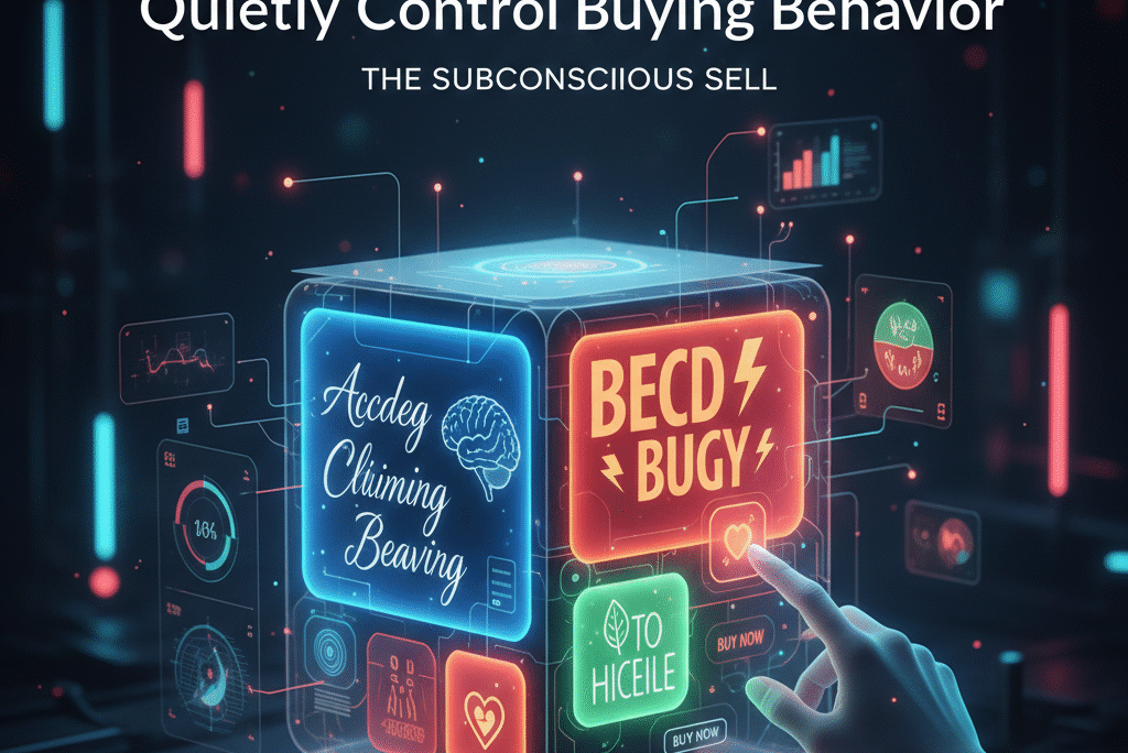
Packaging isn’t decoration. It’s silent persuasion. It shapes trust, signals quality, hints at price, and nudges someone toward Add to Cart without asking permission. The scary part? Most buyers can’t explain why one product “felt right” and another didn’t. Their brain already decided before their logic showed up late to the meeting.
This is why two identical products can sit side by side, priced the same, and one sells 10× better. Not because it’s better. Because it looks better in ways the human brain is wired to reward.
Let’s break down how colors, fonts, and visual cues influence buying behavior—and how smart brands use this knowledge to win quietly.
First: How the Brain Actually Buys
Before we talk design elements, it helps to understand one uncomfortable truth: humans do not buy rationally.
Neuroscience shows that purchasing decisions are driven primarily by emotion and pattern recognition. Logic usually arrives later to justify the choice. This is why people say things like:
- “It just looked more premium.”
- “I trusted this one more.”
- “The other one felt cheap.”
Those aren’t random feelings. They’re signals triggered by visual design.
Packaging works in under three seconds. That’s the window where attention, trust, and perceived value are either established—or lost forever. In ecommerce, it happens even faster, because the image is the product at first glance.
Color Design Psychology: The Fastest Emotional Trigger
Color is the first thing the brain processes. Faster than words. Faster than shapes. Faster than logos.
Different colors trigger different emotional responses, and while culture plays a role, certain patterns show up again and again.
Black, for example, signals authority, luxury, and seriousness. This is why premium tech, skincare, and men’s grooming brands love it. Matte black especially whispers “expensive” without screaming.
White communicates cleanliness, simplicity, and honesty. It’s common in health, wellness, and minimalist brands because it lowers cognitive load and feels safe.
Blue is trust. Banks use it. Tech companies live in it. Blue reduces anxiety and signals stability, which is why it works so well for products involving money, data, or long-term use.
Red is urgency and energy. It raises heart rate. Great for impulse buys, snacks, and sales-driven products—but risky for premium brands if overused.
Green signals nature, health, and balance. It’s the go-to for eco-friendly and organic products, but only works if the rest of the brand supports the claim. Fake green feels dishonest fast.
Yellow grabs attention and signals optimism, but too much turns into visual noise. It’s a spice, not the meal.
Here’s the key mistake brands make: choosing colors based on personal taste instead of buyer psychology. The question isn’t “What colors do we like?” It’s “What emotional state should the buyer feel before they click buy?”
Color Combinations Matter More Than Single Colors
A single color rarely carries the brand. It’s the relationship between colors that shapes perception.
High contrast feels bold and modern. Low contrast feels calm and refined. Warm palettes feel friendly and accessible. Cool palettes feel controlled and professional.
Luxury brands often limit themselves to two or three colors. Budget brands tend to use many. That’s not an accident. Complexity signals cheapness. Restraint signals confidence.
When everything is shouting, nothing sounds premium.
Font Psychology: Your Brand’s Voice Without Sound
Fonts are personalities. People don’t consciously think this—but they feel it.
Serif fonts (with small strokes at the ends) feel traditional, established, and authoritative. They work well for legacy, finance, education, and premium storytelling brands.
Sans-serif fonts feel modern, clean, and approachable. That’s why tech startups and ecommerce brands love them. They reduce friction and feel easy to read, especially on screens.
Script fonts feel personal, artistic, or feminine—but are dangerous if overused. They sacrifice readability for emotion.
Bold fonts feel strong and confident. Thin fonts feel elegant but fragile.
A common rookie mistake is using multiple fonts on packaging. The brain reads that as confusion. One primary font, one secondary at most. Consistency builds trust faster than creativity.
The buyer should never struggle to read your product name. If they do, the brain flags it as effort. Effort kills conversions.
Typography Hierarchy: Guiding the Eye, Not Decorating Space
Good packaging doesn’t ask the buyer to explore. It guides them.
The eye naturally follows hierarchy:
- Product name
- Core benefit
- Supporting detail
- Brand reassurance
When hierarchy is clear, the brain relaxes. When everything is the same size, weight, or importance, the brain works harder—and moves on.
This is why “clean” packaging converts better. It reduces cognitive friction. The buyer feels like they understand the product instantly, even if they don’t.
Understanding beats impressing.
Visual Cues: Shapes, Space & Signals
Beyond color and font, subtle visual cues shape trust.
Rounded shapes feel friendly and safe. Sharp angles feel aggressive and powerful. That’s why kids’ products are soft and curves-heavy, while fitness and performance brands use hard lines.
Whitespace (empty space) is not wasted space. It signals confidence. Brands that leave room around elements feel premium because they aren’t desperate to say everything at once.
Icons, badges, and seals act as trust shortcuts. “Eco-friendly,” “Dermatologist tested,” “Handmade,” or “Small batch” all trigger mental shortcuts—but only if they look credible and aren’t cluttered.
Overuse kills belief. One strong signal beats five weak ones.
Buying Behavior: How Packaging Changes Price Perception
Here’s a fun brain trick: packaging can change how expensive something feels without changing the price.
Minimal packaging increases perceived value. Heavy fonts and loud colors decrease it. Symmetry increases trust. Messiness decreases it.
This is why rebranding alone can boost sales without changing the product. The buyer believes they’re getting more—even when they’re not.
In marketplaces like Amazon, Etsy, and eBay, packaging design also influences review behavior. People are more forgiving of minor issues when the brand feels premium. Cheap-looking brands get punished harder for the same flaws.
Design doesn’t just sell—it buys forgiveness.
Ecommerce Reality: Packaging Starts With the Thumbnail
In physical stores, packaging competes on shelves. Online, it competes in thumbnails.
This means packaging must:
- Be readable at small sizes
- Stand out without looking cheap
- Communicate value instantly
Tiny text, low contrast, and busy designs collapse at thumbnail size. This is why brands that design only for print often fail online.
Smart brands design packaging with digital first, physical second.
The Biggest Packaging Design Mistakes
Most failures come from the same patterns:
- Designing for personal taste instead of buyer psychology
- Using too many colors and fonts
- Overloading packaging with information
- Copying competitors instead of differentiating emotionally
- Ignoring how design looks on marketplace listings
Packaging is not art. It’s applied psychology.
Final Thought: Packaging Is a Salesperson That Never Sleeps
Your packaging speaks before your ads do. Before your copy does. Before your product ever gets touched.
It tells the buyer whether you’re trustworthy, premium, budget, safe, risky, boring, or exciting—all in seconds.
Great packaging doesn’t scream. It signals. It aligns emotion with expectation. It makes buying feel obvious.
When colors, fonts, and visual cues work together, the product stops needing persuasion. The brain already decided.
That’s the quiet power of packaging psychology—and why brands that understand it stop competing on price and start winning on perception.
If packaging design feels overwhelming, that’s usually a sign it’s being treated as decoration instead of strategy. At Eccommate, we help ecommerce brands build packaging, branding, and storefronts that are designed around real buying behavior—not guesses or trends. From private label launches to full brand identity systems, our approach focuses on clarity, trust, and conversion from the very first glance. You can explore how we do this and see our full range of ecommerce services on our main page.
Medicare’s income-related premium adjustments aren’t arbitrary — they’re tied directly to your modified adjusted gross income (MAGI) from earlier tax years, which includes capital gains such as those from stock sales. According to Kiplinger, if your MAGI exceeds certain income thresholds, you may owe higher Medicare Part B and Part D premiums through what’s called the Income-Related Monthly Adjustment Amount (IRMAA). Their breakdown of IRMAA brackets and how this surcharge is calculated can help you better understand how investment gains might affect your future healthcare costs.