There’s a moment every serious ecommerce seller hits sooner or later.
Sales are… fine.
The product works.
Reviews aren’t terrible.
But growth feels stuck, fragile, rented.
You tweak prices. You run ads harder. You blame the algorithm.
Nothing really changes.
What’s actually broken is quieter and more dangerous: you’re selling a product, not a brand.
This case study walks through what that transformation really looks like—from a visually forgettable, “could-be-anyone’s” product into a brand people recognize, trust, and choose even when cheaper options exist. No hype. No magic fonts. Just the mechanics of visual transformations and how visual identity reshapes perception, conversion, and long-term value.
This is written for humans who sell to other humans.
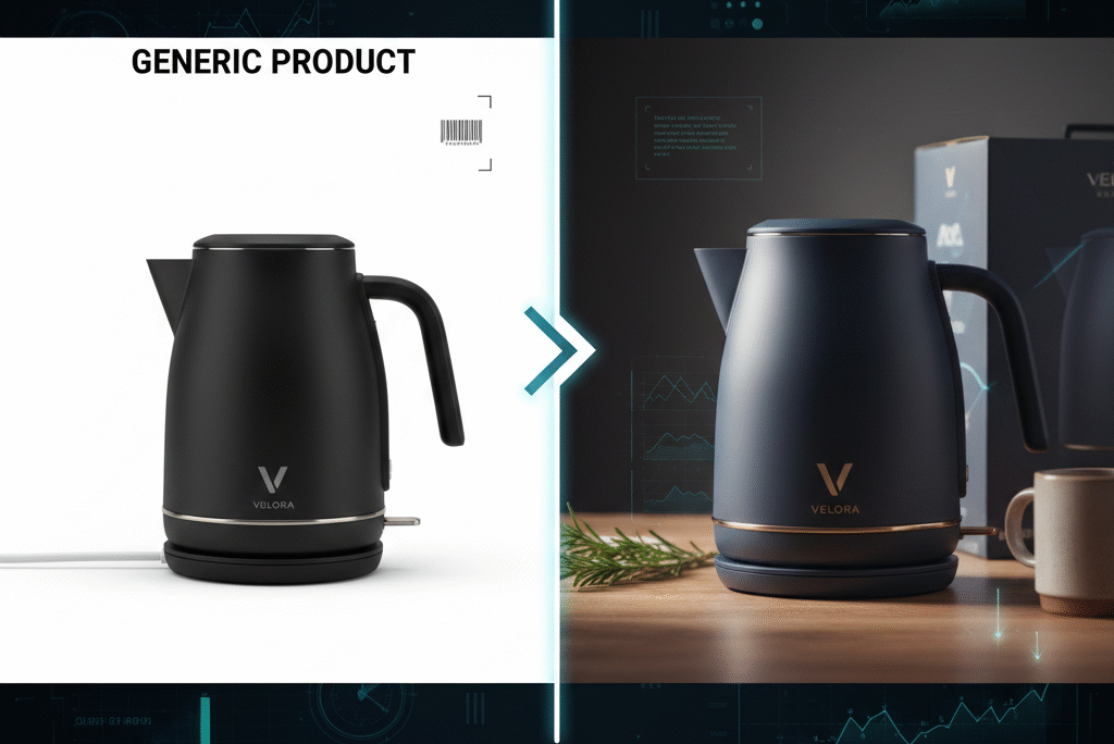
The Starting Point: A Perfectly Fine, Perfectly Forgettable Product
The product itself wasn’t bad. In fact, that’s what made the problem sneaky.
It lived in a crowded Amazon category. Think hundreds of nearly identical listings. Same shapes. Same features. Same promises. Different logos slapped on like name tags at a conference.
Visually, the product suffered from the three classic symptoms of generic-itis:
- Logo that looked like it came free with the supplier
Thin font. Random icon. Zero personality. It didn’t offend anyone, but it didn’t stick either. - Packaging that screamed “I exist” instead of “I belong”
White box. Stock icons. Bullet points crammed everywhere like a last-minute resume. - Listing images that explained, but didn’t persuade
They showed what the product was, not what owning it felt like.
Conversion rate hovered around average. PPC worked, but only when aggressively funded. Repeat purchases were rare. Off-Amazon recognition was nonexistent.
In other words: the product was surviving, not compounding.
The Diagnosis: Why Visuals Matter More Than Features
Here’s the uncomfortable truth most sellers resist:
Customers don’t compare features first.
They compare signals.
Before anyone reads a bullet point, their brain asks a few rapid-fire questions:
- Does this look legit?
- Does this feel like a brand or a random seller?
- Will I regret buying this?
- Is this “safe”?
Visual branding answers those questions instantly, silently, and emotionally.
In a saturated marketplace, design is a trust shortcut.
So the goal wasn’t to “make it prettier.”
The goal was to control perception.
Step One: Defining the Brand Before Designing Anything
This is where most people mess up. They jump straight into colors and logos without deciding who they’re talking to.
Before any visuals changed, we locked down three things:
Who is this product for?
Not “everyone.” A specific buyer with a specific context. Age range, use case, emotional motivation.
What problem does it emotionally solve?
Beyond function. Convenience? Confidence? Relief? Simplicity?
What should the brand feel like in one word?
Not ten adjectives. One anchor word. Calm. Bold. Precise. Friendly. Premium.
That one word quietly guides every visual decision that follows.
Design without positioning is decoration.
Design with positioning is strategy.
Step Two: Visual Transformation — From Placeholder to Personality
The old logo was doing the bare minimum: identifying the product.
The new logo had a different job: signal intent.
Changes weren’t dramatic for drama’s sake. They were deliberate:
- Font switched from generic sans-serif to a typeface that matched the brand’s personality
- Icon simplified so it worked at tiny Amazon thumbnail sizes
- Spacing adjusted to feel confident, not cramped
Most importantly, the logo stopped trying to explain the product.
It started representing the brand.
That’s a subtle but massive shift.
A good ecommerce logo isn’t a diagram.
It’s a flag.
Step Three: Color Palette — Choosing Emotion Over Trend
Random color choices are one of the fastest ways to look amateur.
Instead of asking “what colors look nice,” the question became:
“What colors does this customer already trust?”
We studied the category leaders. Not to copy them, but to understand the visual language of legitimacy in that niche.
The final palette had:
- One dominant color (recognition)
- One supporting neutral (balance)
- One accent color (attention)
No rainbow. No gradients-for-the-sake-of-it.
Consistency beats creativity here.
When customers scroll, familiarity lowers friction.
Your brand should feel new, not risky.
Step Four: Packaging — Turning the Box Into a Sales Tool
Packaging is often treated as an expense. That’s short-term thinking.
Packaging is the first physical handshake with your customer.
We stripped away clutter. Fewer icons. Fewer claims. More white space. Clear hierarchy.
The front of the box did three things only:
- Stated what the product is
- Reinforced the brand visually
- Made the buyer feel they chose well
Everything else moved to the sides or inside.
Inside the box, a simple branded insert replaced generic thank-you cards. No begging for reviews. Just tone-consistent, human language.
This does something powerful:
It turns the purchase into an experience, not a transaction.
Step Five: Listing Images — Selling the Feeling, Not the Object
Here’s where conversions quietly doubled.
Old images were informational.
New images were narrative.
Instead of starting with features, the first image focused on outcome.
Instead of isolated product shots, images showed context and scale.
Instead of shouting benefits, they demonstrated them visually.
Text on images was reduced but sharpened. Fewer words, stronger claims.
The sequence mattered:
- Emotional hook
- Use-case clarity
- Key differentiator
- Proof or reassurance
- Practical details
Customers didn’t need to read everything.
They just needed to feel confident enough to click “Buy Now.”
Step Six: Extending the Brand Beyond Amazon
This is where brands separate from sellers.
A simple website followed. Nothing fancy. Clean, fast, on-brand.
The goal wasn’t to replace Amazon.
It was to validate the brand’s existence.
Social profiles were aligned visually, even if posting wasn’t aggressive yet. Same colors. Same tone. Same identity.
Now when a customer Googled the brand name, they didn’t find a dead end.
They found coherence.
Coherence builds trust.
Trust builds pricing power.
The Results: What Changed (And What Didn’t)
Here’s the part people expect to be magical. It wasn’t.
Ads didn’t suddenly become free.
Competition didn’t vanish.
The algorithm didn’t send flowers.
What changed was efficiency.
- Conversion rate increased without extra ad spend
- PPC became more forgiving
- Customer questions dropped
- Reviews mentioned “quality” and “brand” more often than features
- The product became easier to launch variants under
Most importantly, the business stopped feeling disposable.
That’s the real win.
The Real Lesson: Branding Isn’t About Looking Big
Branding isn’t pretending you’re Nike.
It’s making sure every visual touchpoint tells the same story, quietly, consistently.
Generic products compete on price.
Brands compete on belief.
One is exhausting.
The other compounds.
If your product disappeared tomorrow, would anyone notice?
That’s the uncomfortable branding test.
Final Thought: Products Make Sales, Brands Make Businesses
Anyone can launch a product.
Not everyone can build something that lasts.
Visual change isn’t cosmetic surgery.
It’s identity alignment.
When the visuals finally match the value, customers feel it instantly—even if they can’t explain why.
And in ecommerce, that feeling is often the difference between scrolling past… and clicking buy.
Building a real brand isn’t about flashy logos or copying what’s already ranking. It’s about aligning product, visuals, and strategy so everything works together instead of fighting for attention. That’s exactly how we approach ecommerce at Eccommate—from private label strategy to branding, listings, websites, and growth systems that actually scale. If you’re done selling “just another product” and want to build something durable, you can explore how we do it.
Design isn’t decoration—there’s real research showing that consistent visual brand identity isn’t just nice to have, it actually shapes how people remember and prefer brands. A recent study on visual brand identity found that when logos, colors, and other design elements are aligned and coherent, it enhances brand recall and connects more strongly with consumers in competitive markets. Linking to insights like this helps explain why the visual transformation we walked through isn’t just aesthetic, it’s strategic.