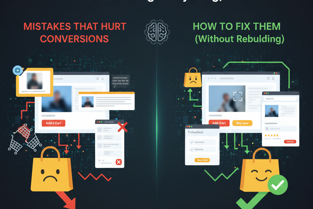
This is for ecommerce founders who are getting traffic — sometimes real, qualified traffic — and watching it leave without buying, while the explanations they’re given point everywhere except the website itself. Sometimes the traffic really is the problem. Far more often, the website is quietly making purchasing harder than it needs to be, in ways nobody notices because nothing looks obviously broken.
When the Product Isn’t the Problem: It’s the Ecommerce Website Design
There’s a specific kind of frustration that builds when an ecommerce site has decent traffic, a product that genuinely works, reasonable pricing, and conversion rates that stay stubbornly below where they should be. The instinct is to look outward — maybe the ads are pulling the wrong audience, maybe the SEO is bringing in browsers rather than buyers, maybe the market itself is softer than expected.
Sometimes those explanations are correct. But in a large proportion of cases, the actual answer is uncomfortable precisely because it’s so unglamorous: the website itself is creating friction at dozens of small points, none of which look like failures individually, but which collectively make the path from “interested” to “purchased” longer and more uncertain than it needs to be.
This isn’t about a site looking unprofessional or outdated in any obvious way. Many of the sites with the worst conversion problems look genuinely good — clean, modern, on-brand. The problems live beneath the surface aesthetics, in the structure of how information is presented, how decisions are guided, and how much cognitive effort a visitor has to expend before they feel confident enough to click “buy.”
This piece works through the design patterns that consistently undermine conversion — not as abstract design theory, but as specific, recognizable problems that show up across ecommerce sites constantly, along with what addressing them actually requires. None of this is about chasing design trends or producing something that looks impressive in a portfolio. It’s about removing the friction that sits between a visitor and a purchase they were already inclined to make.
In this guide, we will teach you about these mistakes and how to fix them.
Mistake One: Designing for Impression Instead of Decision-Making
There’s a category of ecommerce website that looks genuinely striking — large hero images, generous whitespace, restrained typography, subtle animations — and converts poorly despite all of it, or sometimes because of it.
The pattern emerges when a website is designed primarily to create an impression of quality rather than to actively support the decisions a buyer needs to make. The homepage might feature a beautiful lifestyle image with a tagline like “Elevate Your Everyday” — aesthetically cohesive, brand-appropriate in tone, and almost entirely uninformative. A visitor looking at it doesn’t know what’s actually being sold, who it’s for, or why they should care, beyond a vague aspirational feeling.
The underlying issue is a confusion between two different jobs a website can do. One job is to communicate brand identity — tone, aesthetic, the feeling the brand wants to be associated with. The other job is to help a specific visitor, who arrived with some level of interest or intent, figure out whether this site has what they’re looking for and whether they should trust it enough to buy.
Brand identity matters. But when it’s prioritized to the exclusion of the second job — when the homepage answers “what does this brand feel like” without answering “what do you sell, who is it for, and why should I trust it” — visitors are left to do work the website should be doing for them. Some will scroll further looking for answers. Many will simply leave, because the cognitive cost of figuring out what’s being sold exceeds their patience, especially if they arrived without a strong pre-existing commitment to this specific brand.
The fix isn’t to abandon aesthetic quality — it’s to recognize that clarity and aesthetics aren’t actually in tension. The best ecommerce sites are both visually considered and immediately legible: a visitor can tell within a few seconds what’s being sold, get a sense of who it’s for, and see enough specificity to feel like this is a real business with a real offering rather than an aspirational mood board. Design should be in service of that legibility, not competing with it.
Mistake Two: A Value Proposition That Says Nothing Specific
The area of a webpage visible before any scrolling — commonly called “above the fold,” a term that’s outlived the print context it came from but still describes something real — carries an outsized amount of responsibility. It’s the first thing every visitor sees, and it’s where the decision to keep looking or leave gets made, often within a few seconds.
A remarkable number of ecommerce sites use this space on something that communicates almost nothing concrete. Taglines built around abstract concepts — feeling, lifestyle, transformation — without ever stating what’s actually for sale. Text sized so small or styled so subtly that it barely registers as content rather than decoration. Brand voice prioritized so heavily that the actual offering gets lost underneath it.
The test for whether a value proposition is working is simple: could a visitor who knows nothing about this brand, reading only what’s above the fold, answer three questions? What is being sold? Who is it for? Why is this option better or different from alternatives? If the honest answer is no — if a visitor would need to scroll, hover, or click to find out what the site actually sells — the value proposition isn’t doing its job, regardless of how polished it looks.
This doesn’t require long copy or a hard sell. Some of the most effective above-the-fold content is just a handful of words, precisely chosen. The precision is what matters — not length, not cleverness, but the specific information that lets a visitor immediately self-identify as someone this is relevant to (or not, which is also valuable — a visitor who quickly realizes a site isn’t for them and leaves isn’t a lost conversion, because they were never going to convert; the cost is borne by visitors who were a good fit but couldn’t tell quickly enough).
Clever, in the absence of clear, doesn’t just fail to help — it actively costs conversions from visitors who would have bought if they’d understood what was on offer fast enough to stay interested.
Mistake Three: Navigation That Requires Thought
Good navigation is invisible. Visitors use it without noticing they’re using it — they think about what they want, glance at the menu, and find the relevant path without any sense of having made a navigation decision at all.
Navigation becomes visible — and becomes friction — when it requires actual thought. This happens in a few recognizable ways. Menus with too many top-level categories, forcing visitors to scan and evaluate multiple options before choosing. Category names that prioritize brand voice over clarity — “Collections,” “Editions,” “The Edit,” “Experiences” — which might sound appropriately on-brand but require a visitor to translate brand language into the plain-language category they’re actually looking for. Nested menu structures that require hovering, clicking, and backtracking to find specific products.
Every one of these adds a small amount of cognitive load, and cognitive load compounds. A visitor who has to think for even a couple of extra seconds about where to click is a visitor whose attention has shifted from “do I want this product” to “how does this website work” — and that shift, repeated across multiple navigation decisions, is enough to lose visitors who had genuine purchase intent but ran out of patience navigating toward it.
The underlying principle is that buyers arriving at an ecommerce site are typically not there to explore — they’re there to find something, whether that’s a specific product they already know they want or a category they’re browsing with reasonably specific intent. Navigation that’s built around exploration — designed to showcase the breadth of a catalog, to tell a brand story through category structure — often works against the finding behavior that most visitors are actually engaged in.
Plain language, a limited number of clear top-level categories, and a structure that maps to how customers actually think about what they’re looking for (rather than how the business internally organizes its catalog) consistently outperforms more elaborate or creative navigation structures. Simple isn’t a compromise here — it’s the thing that actually works.
Mistake Four: A Mobile Experience That Technically Works But Doesn’t Feel Good
Mobile commerce has been the majority of ecommerce traffic for long enough that “mobile-friendly” should be a baseline rather than a differentiator. And yet mobile experience issues remain one of the most consistent sources of lost conversions across ecommerce sites in 2026 — not because sites don’t work on mobile in a technical sense, but because working and feeling good to use are different standards, and a lot of sites only clear the first one.
The specific problems are familiar to anyone who’s shopped on a phone recently. Tap targets — buttons, links, form fields — sized for a cursor rather than a fingertip, requiring precise tapping that doesn’t match how people actually hold and interact with their phones. Text that’s readable on desktop but cramped or too small on mobile, requiring zooming or squinting. Images that dominate the viewport, pushing the actual content — and any call to action — below what’s visible without scrolling. Popups, particularly ones that are difficult to dismiss on a small screen, interrupting the browsing experience at exactly the moments when a visitor is trying to evaluate something. Sticky headers or navigation bars that consume a disproportionate amount of limited mobile screen space.
None of these problems individually feels catastrophic. Collectively, they create an experience that feels effortful — and mobile shoppers, who are frequently in distracted or low-patience contexts (waiting in line, half-watching something else, browsing during a commute), have particularly little tolerance for effort. A mobile visitor who encounters friction doesn’t typically push through it the way a desktop visitor with more attention to spare might. They close the tab, and the brand’s actual quality or value never gets a chance to register.
The standard worth holding mobile experience to isn’t “does this work on a phone” but “does this feel as easy on a phone as it does on a laptop, accounting for the different interaction model.” That standard requires actually using the site on a phone — not just checking that a responsive design framework has been applied — and noticing where things feel slightly harder than they should, even when nothing is technically broken.
Mistake Five: Speed Issues That Erode Trust Before a Visitor Reads a Word
Page load speed is one of those factors that visitors almost never consciously evaluate and almost always unconsciously respond to.
A slow-loading page doesn’t typically produce a visitor who thinks “this site is slow, I should leave.” It produces a visitor who feels a vague sense of friction or hesitation — the digital equivalent of a slightly sticky door handle — and who is measurably more likely to leave without that hesitation ever rising to conscious awareness. The effect compounds with the specific psychology of ecommerce, where trust is already something visitors are actively (if unconsciously) assessing. A site that feels slow primes doubts that wouldn’t otherwise surface: will checkout actually work? Is this a real, well-run business? Is my payment information going somewhere safe?
The causes of slow load times are usually accumulation rather than a single dramatic issue — high-resolution images that haven’t been optimized for web delivery, animation and interaction libraries that load on every page regardless of whether they’re used, themes or templates with more functionality (and more loading overhead) than the site actually needs, and third-party scripts — analytics, chat widgets, marketing pixels — that each add a small delay which becomes substantial in aggregate.
The data on how much speed matters is not subtle — well-documented research has shown that even delays measured in a single second can produce meaningful drops in conversion rate, and the effect is more pronounced on mobile, where network conditions are more variable and patience is generally lower.
Google’s research on page speed and business metrics documents this relationship across multiple industries, showing that performance improvements translate into measurable gains in conversion rate, bounce rate, and revenue per visitor.
Fast sites don’t just avoid annoying visitors — they actively communicate competence and legitimacy in a way that’s hard to replicate through other means. Speed is, in a very real sense, a trust signal, even though almost nobody would describe it that way if asked directly.
Mistake Six: Product Pages That Describe Instead of Sell
The product page is where purchase decisions actually get made, and it’s also one of the most consistently underinvested pages on ecommerce sites — frequently populated with whatever description came from the supplier, formatted into bullet points, with little additional thought given to what would actually move a visitor from interested to convinced.
The pattern is recognizable: a product description that reads like a specification sheet — materials, dimensions, technical features — without context for why any of it matters to the person reading it. No explanation of what problem the product solves, what situation it’s designed for, or what the experience of owning and using it is actually like. Images that show the product cleanly but in isolation, without any sense of scale, context, or use.
The fundamental issue is that most purchase decisions aren’t driven by specifications — they’re driven by outcomes. A buyer evaluating a product isn’t primarily asking “what is this made of” — they’re asking, even if not consciously, “will this solve my problem, will it fit into my life the way I need it to, and will I regret this purchase.” A product page that only answers the first question, while leaving the second and third unaddressed, is leaving the actual decision-making work to the visitor — work that a percentage of visitors won’t bother doing, choosing instead to leave and look at a competitor’s listing that does more of that work for them.
Product pages that convert well tend to address, explicitly or through careful image and copy choices, what problem the product solves, who it’s particularly well-suited for, how it fits into the buyer’s actual life or routine, and why the price is justified relative to alternatives — addressing the value question before the visitor has to wonder about it themselves. Images that include lifestyle or in-use context, alongside clean product shots, help bridge the gap between “here’s an object” and “here’s what owning this object would be like” — which is closer to what the buyer is actually trying to evaluate.
None of this requires lengthy copy. It requires copy and imagery that’s been thought through from the buyer’s perspective rather than assembled from whatever content was easiest to obtain.
It’s also worth noting that even a well-built product page can’t fully compensate for the wrong traffic arriving at it. A page optimized to convert buyers with strong purchase intent will still underperform if the traffic reaching it is primarily curious browsers or comparison shoppers with no near-term intent to buy. Understanding which search terms and campaigns are actually producing buyers — versus just clicks — is a separate but related diagnostic that’s worth running alongside any page-level optimization, since it determines whether a conversion problem is a page problem, a traffic problem, or both.
Mistake Seven: Calls to Action That Don’t Feel Like Calls to Action
A call to action’s entire job is to be unmistakable — the next step should be obvious enough that a visitor who’s ready to act doesn’t have to look for how.
Yet weak or unclear CTAs are extremely common, usually as an unintended consequence of design choices made for other reasons. A button color that matches the site’s muted palette so closely that it doesn’t visually stand out from surrounding content. A primary action — “Add to Cart,” “Buy Now” — positioned below other, less important actions, or competing visually with secondary actions like “Add to Wishlist” or “Compare” in ways that dilute which action the visitor should actually take. CTAs that exist but are placed below the fold on pages where the relevant content (and the decision point) occurs higher up.
The psychology here is straightforward: when someone has reached the point of being ready to act, any uncertainty about how to act — even momentary uncertainty, even a half-second of “wait, which button is the one I want” — introduces a chance for the moment to pass. Decisiveness on the visitor’s part needs to be matched by clarity in the interface; if the interface hesitates (visually, through ambiguous design), the visitor’s decisiveness has nothing to act on.
Making CTAs effective isn’t about aggressive design or manipulative urgency tactics — it’s about visual clarity and consistency. The primary action on any given page should be visually distinct from secondary actions, consistently styled and positioned across the site so visitors build a mental model of “this is what the important button looks like,” and positioned where the decision is actually being made rather than requiring a scroll after the decision point. This is guidance, not pressure — making the obvious next step actually obvious.
Mistake Eight: Missing the Trust Signals That Buyers Are Looking For
Every visitor to an ecommerce site — particularly one they haven’t bought from before — is running an implicit trust assessment, whether or not they’d describe it that way. Is this a real business? Will my order actually arrive? If something’s wrong, can I get help or a refund? Is this site safe to enter payment information into?
The business itself might be entirely legitimate, well-run, and trustworthy. But visitors don’t have access to that internal reality — they only have access to what the website communicates, and a site that’s missing the signals visitors look for to answer these questions feels less trustworthy regardless of the underlying reality.
The specific signals that matter include genuine customer reviews or testimonials (their absence is noticeable, especially in categories where reviews are expected), a clearly stated and easy-to-find return or refund policy (ambiguity here is one of the most common pre-purchase concerns), visible and genuine contact information (a site with no way to reach a human feels riskier, even if most visitors never intend to use it), some indication of who’s behind the brand — even briefly — rather than feeling like an anonymous storefront, and real photography rather than generic stock imagery, particularly for the products themselves but also for any team or behind-the-scenes content.
None of these signals individually makes or breaks a purchase decision for most visitors. But their cumulative absence creates a sense that something is unfinished or hastily assembled — and “unfinished” reads, to a cautious buyer, as “possibly not trustworthy with my money.” Conversely, their cumulative presence creates the sense of an established, considered business — which is exactly the impression that makes visitors comfortable proceeding to checkout.
Mistake Nine: Too Many Choices, Presented at Once
Choice is generally framed as a positive in ecommerce — more variations, more bundles, more options to fit more customers. And to a point, that’s true. But choice has a cost that’s easy to overlook: every additional option presented at the moment of decision is something the visitor’s brain has to process, compare, and resolve before moving forward — and that processing has a cognitive cost that, past a certain point, starts working against conversion rather than for it.
This shows up most visibly on product pages with extensive variation selectors — multiple sizes, colors, bundle configurations, add-on options, all presented simultaneously with no guidance about which combination is the “normal” or recommended choice. A visitor faced with this has to make several decisions just to get to the point of adding something to their cart, and each of those decisions is an opportunity to pause, hesitate, or simply not bother.
The phenomenon underlying this is sometimes called decision fatigue or choice overload — well-documented in behavioral research showing that beyond a certain number of options, additional choice doesn’t improve decision quality or satisfaction; it degrades both, sometimes to the point where people disengage entirely rather than choose at all.
The fix isn’t necessarily reducing the actual number of options available — it’s reducing the number of decisions a visitor has to actively make to arrive at a purchase. A sensible default selection, pre-chosen and clearly indicated as the recommended or most popular choice, lets visitors who don’t have strong preferences proceed immediately, while still allowing visitors who do have preferences to change the selection. Presenting options progressively — core decision first, secondary options revealed after — rather than all at once, similarly reduces the moment-to-moment cognitive load even when the total amount of choice available hasn’t changed.
Mistake Ten: A Checkout Process That Asks for Effort at the Worst Possible Moment
By the time a visitor reaches checkout, they’ve effectively said yes. They’ve decided to buy. Checkout’s job is to honor that decision as efficiently as possible — and a remarkable number of checkout flows do the opposite, introducing friction at precisely the point where a buyer’s continued cooperation is most fragile.
The specific problems are well-known but persistent: required account creation before a guest can complete a purchase, adding a step (and a perceived commitment) that wasn’t part of the original decision to buy. Shipping costs or fees that appear for the first time at checkout, after a visitor has already mentally committed to a total price — a classic and well-documented cause of cart abandonment.
Baymard Institute’s ongoing research into cart abandonment has consistently identified unexpected costs and forced account creation as among the most common reasons buyers cite for abandoning a purchase they’d already decided to make.
Forms requesting more information than is actually necessary to complete the transaction. Multi-page checkout flows without clear indication of progress, leaving visitors uncertain how much further there is to go. Unexpected steps — additional offers, surveys, or upsells inserted into the checkout flow itself — that interrupt the momentum of a buyer who was already proceeding toward completion.
Every one of these adds a moment where a buyer who has already said yes is given a reason to reconsider — and reconsideration, at checkout, overwhelmingly favors abandonment rather than completion, because the buyer’s motivation peaked at the moment of adding to cart and has been gradually decaying ever since.
The best checkout experiences are, almost by definition, unmemorable. They’re fast, they ask for the minimum information actually required, they show shipping and total costs as early as possible rather than as a checkout-stage surprise, they offer guest checkout without friction, and they communicate progress clearly enough that a buyer always knows roughly how much is left. None of this is creative or differentiated — and that’s the point. Checkout is not where a brand should be trying to make an impression; it’s where a brand should be getting out of the way.
Mistake Eleven: A Site That Feels Like It Was Built By Different People (Because It Was)
Inconsistency in branding — fonts, colors, imagery style, tone of voice — across different pages or sections of a website is extremely common, particularly for businesses that have grown organically, used multiple designers or freelancers over time, or bolted new pages and features onto an existing site without revisiting the whole.
The effect of this inconsistency is subtle but real. Visitors don’t typically consciously notice “the typography on this page is different from the homepage” — but they do register, at some level, that something feels slightly off, slightly less cohesive, slightly less like a single, considered entity. And that feeling — even when it can’t be articulated — contributes to the same trust assessment discussed earlier. A site that feels stitched together from different sources feels, correspondingly, like a business that might be stitched together from different sources — less coordinated, less considered, less reliable.
Consistency doesn’t require elaborate brand guidelines or a complete redesign to achieve — it requires establishing a small set of core decisions (color palette, typography choices, photography style, tone of voice) and applying them deliberately across whatever pages and content get added going forward, plus a periodic pass to bring older content into alignment with current standards. The goal isn’t visual perfection — it’s the sense of intentionality that consistency creates, which translates directly into the sense of trustworthiness that visitors are looking for.
Mistake Twelve: Treating the Website as Finished
Of everything covered here, this last one might be the highest-leverage, because it’s less a specific design flaw than a mindset that determines whether any of the other issues ever get identified and fixed.
Many ecommerce businesses approach their website the way they might approach a piece of physical signage — design it, install it, and consider the job done until something breaks obviously enough to require attention. This made more sense in eras when websites were genuinely expensive and slow to change. It makes much less sense now, when the cost of testing, adjusting, and iterating on a website is a small fraction of what it once was — and when buyer expectations and behavior continue to shift in ways that a static site gradually falls out of step with.
The businesses that consistently see their conversion rates improve over time treat their website as something that’s never finished — not in the sense of constant disruptive redesigns, but in the sense of an ongoing practice of small adjustments based on actual visitor behavior. Testing different headlines or value propositions. Adjusting product page structure based on what questions keep coming up in customer service. Refining navigation based on what visitors actually search for or click. Revisiting checkout based on where abandonment is concentrated.
None of this requires a large team or a significant budget — it requires the recognition that a website’s first version is a starting hypothesis, not a finished product, and that the gap between “looks done” and “performs well” is closed through observation and iteration rather than through the initial build alone.
The Pattern Underneath All of These
Every mistake covered here, despite looking quite different on the surface, traces back to the same underlying dynamic: friction introduced — almost always unintentionally — at points where a visitor is trying to make a decision, and where that friction makes the decision slightly harder, slower, or more uncertain than it needs to be.
None of these issues are dramatic individually. A slightly unclear value proposition, a navigation menu that requires a moment of thought, a checkout flow with one extra unnecessary field — none of these alone would explain a meaningfully underperforming website. But ecommerce conversion isn’t determined by any single factor in isolation; it’s the cumulative result of every point of friction a visitor encounters on their way to a purchase decision, and small frictions compound in ways that are easy to underestimate.
This is also, in a sense, good news. Fixing these issues rarely requires a complete rebuild — it requires identifying where friction exists and removing it, point by point. A site doesn’t need to become something fundamentally different to convert significantly better; it often just needs to become slightly easier, slightly clearer, and slightly more guided at each of the points where visitors are currently being asked to do work the website should be doing for them.
The ultimate marker of a website that’s gotten this right is that visitors don’t notice the design at all. They don’t think about navigation, or load times, or where the buy button is, or whether they trust the site enough to enter their payment details. They just move from interested to purchased without anything getting in the way — and that absence of friction, that sense of effortlessness, is precisely what good ecommerce design is actually for.
Frequently Asked Questions About Ecommerce Conversions and Design
How do I know if my conversion problem is a design problem or a traffic problem?
The clearest signal is segmenting conversion rate by traffic source and intent level. If traffic from high-intent sources — branded search, returning visitors, traffic from sources known to have strong purchase intent — also converts poorly, that points toward design and on-site experience issues. If conversion rate looks reasonable for high-intent traffic but poor for broader or more exploratory traffic, the issue may be more about traffic quality and targeting than the site itself. Most businesses benefit from examining both, since they’re often not mutually exclusive.
Do I need to fix all of these issues at once?
No, and attempting to is often counterproductive. The issues that affect the highest-traffic pages — typically the homepage, key category pages, and your best-selling product pages — generally deserve priority, since improvements there affect the largest number of visitors. Checkout issues are also high-priority regardless of traffic volume, since checkout abandonment directly represents visitors who were already convinced. Working through issues prioritized by impact, rather than attempting a simultaneous overhaul, produces results faster and with less disruption.
How often should an ecommerce website be updated or tested?
There’s no universal schedule, but the useful framing is continuous rather than periodic — small, ongoing adjustments based on actual data and behavior, rather than infrequent large redesigns. Many ecommerce businesses benefit from a regular (monthly or quarterly) review of key metrics — conversion rate by page type, checkout abandonment points, mobile versus desktop performance — to identify where attention is currently most needed, rather than working from a fixed redesign schedule disconnected from actual performance data.
Is mobile optimization really still an issue in 2026?
Yes, persistently, though the nature of the issue has shifted. Most ecommerce sites are technically responsive — they don’t break on mobile devices. But “doesn’t break” and “feels effortless to use” are different standards, and many sites that pass the first standard don’t meet the second, particularly around tap target sizing, content prioritization on smaller screens, and the cumulative effect of popups, sticky elements, and heavy media on an already-constrained viewport.
Can small businesses realistically address all of this without a large budget?
Yes — most of what’s covered here is about decisions and structure rather than expensive custom development. Clarifying a value proposition, simplifying navigation, removing unnecessary checkout fields, ensuring consistent use of an existing brand palette, and writing product copy that addresses outcomes rather than just specifications are all achievable without significant additional spend. The investment required is primarily attention and a willingness to look at the existing site critically — which is often the actual barrier, more than budget.
Final Thought: Friction Is Invisible Until It’s Removed
The defining characteristic of the mistakes covered in this guide is that they’re invisible by default. Nobody builds a website intending to make navigation confusing, or checkout effortful, or product pages uninformative. These things accumulate — through reasonable individual decisions, through growth that outpaces revisiting earlier choices, through design priorities that favor appearance over function in ways that feel justified in isolation.
The result is a website that looks, by most surface measures, perfectly fine — and that’s exactly why these issues persist. There’s no obvious signal pointing at them. The only signal is the gap between the traffic a site receives and the conversions it produces, and that gap gets attributed to everything except the site itself, because the site looks fine.
Removing this kind of friction doesn’t produce a dramatic, visible transformation in most cases — it produces a website that feels, to visitors, slightly easier to use than it did before, in ways most of them will never consciously notice. But that slight ease, multiplied across every visitor who would otherwise have hesitated, scrolled away in confusion, or abandoned a checkout one field too many — that’s where conversion rate actually comes from.
The product was probably never the problem. The experience around it usually is — and the experience is also, encouragingly, the thing that’s most directly within a business’s control to fix.
If you’re seeing traffic that isn’t converting the way it should and want help identifying exactly where the friction is and how to remove it, you can explore how we approach ecommerce website design strategy at ecommate.co.uk.