If your ecommerce website gets traffic but not enough sales, the problem usually isn’t your product.
It’s the experience.
People love to blame ads, SEO, the economy, or “low intent traffic.” Sometimes that’s true. Most of the time, though, the real issue is simpler and more uncomfortable: your website quietly makes buying harder than it needs to be.
Not in obvious ways. Not with giant red warning signs. But through small design decisions that feel harmless and slowly bleed conversions.
Let’s talk about the biggest ecommerce website design mistakes that hurt conversions — the ones we see constantly — and why they matter more than most founders realize.
This isn’t about aesthetics for Dribbble screenshots. This is about psychology, trust, and friction.
1. Designing for Looks Instead of Buying Behavior
A beautiful website that doesn’t convert is just digital art.
One of the most common mistakes is designing an ecommerce site like a brand showcase instead of a sales environment. Big hero images. Minimal text. Clever animations. Vague headlines. Everything looks premium… and nothing answers basic buyer questions.
Real buyers want clarity before beauty.
They want to know:
- What is this product?
- Who is it for?
- Why should I trust it?
- Why should I buy this one?
When the homepage is just “Elevate Your Lifestyle” over a glossy image, you’ve said nothing. It feels aspirational but empty. Visitors scroll, feel uncertain, and leave.
High-converting ecommerce sites don’t confuse. They guide.
Design should support decision-making, not distract from it.
2. Weak or Confusing Value Proposition Above the Fold
Above the fold is sacred territory. You get about three seconds to convince someone they’re in the right place.
Many ecommerce sites waste this space.
You’ll see:
- Brand slogans with no meaning
- Abstract taglines
- Text so small it might as well not exist
If someone lands on your site and can’t immediately understand what you sell and why it matters, they won’t hang around to decode it.
A strong value proposition answers three things instantly:
- What you sell
- Who it’s for
- Why it’s better or different
This doesn’t require long paragraphs. It requires precision.
Clarity beats clever every single time.
3. Overcomplicating Navigation
Navigation should feel invisible.
If users have to think about where to click next, you’ve already lost momentum. Overloaded menus, too many categories, or clever naming conventions (“Collections,” “Editions,” “Experiences”) slow people down.
Buyers don’t want to explore. They want to find.
Good ecommerce navigation:
- Uses plain language
- Limits choices
- Makes product discovery effortless
Every extra click is a chance to leave. Every moment of confusion is friction.
Simple sites sell better. Always.
4. Poor Mobile Experience (Still, Somehow)
It’s 2026 and mobile issues are still killing conversions.
Many ecommerce sites technically work on mobile but feel awful to use. Buttons too small. Text too cramped. Images taking over the screen. Popups blocking content. Sticky headers eating space.
Mobile shoppers are impatient and distracted. They’re often one thumb away from closing the tab.
If your mobile experience isn’t fast, readable, and tap-friendly, you’re bleeding sales quietly and consistently.
Mobile-first isn’t a buzzword. It’s survival.
5. Slow Load Times That Destroy Trust
Speed is trust.
A slow website doesn’t just annoy users — it makes them doubt you. If the site feels sluggish, buyers subconsciously wonder:
- Is this brand legit?
- Will checkout work?
- Is my payment safe?
Heavy images, unnecessary animations, bloated themes, and poorly optimized scripts all add friction.
Even a one-second delay can noticeably reduce conversions.
People don’t consciously think “this site is slow, so I won’t buy.” They just feel resistance and leave.
Fast sites feel professional. Slow sites feel risky.
6. Product Pages That Don’t Do the Selling
A product page should act like a skilled salesperson.
Most don’t.
Common problems:
- Generic descriptions copied from suppliers
- Feature lists with no context
- Missing use cases
- No emotional pull
- No objection handling
Shoppers don’t buy specs. They buy outcomes.
Instead of just listing what the product is, high-converting product pages explain:
- What problem it solves
- Who it’s best for
- How it fits into the buyer’s life
- Why it’s worth the price
Images matter too. Not just clean product shots, but lifestyle visuals that help buyers imagine ownership.
If your product page doesn’t reduce doubt, it increases hesitation.
7. Weak or Hidden Calls to Action
You’d be surprised how many ecommerce sites whisper when they should speak clearly.
“Add to cart” buttons that blend into the background. Calls to action buried below the fold. Multiple CTAs competing with each other.
A buyer shouldn’t have to hunt for the next step.
Calls to action should be:
- Visually clear
- Consistently placed
- Action-oriented
This isn’t manipulation. It’s guidance.
When people are ready to buy, make it obvious how.
8. Ignoring Trust Signals
Trust is the currency of ecommerce.
If visitors don’t trust your site, nothing else matters.
Common trust-killers include:
- No reviews or testimonials
- No clear return policy
- No contact information
- No brand story
- Generic stock photos everywhere
You might know your business is legitimate. Visitors don’t.
They look for reassurance in small details:
- Social proof
- Real images
- Clear policies
- Professional design consistency
A site without trust signals feels unfinished. And unfinished feels unsafe.
9. Overwhelming the Buyer With Too Many Choices
Choice feels empowering until it becomes exhausting.
When a product page has too many variations, bundles, add-ons, and upsells all at once, buyers freeze.
Decision fatigue is real.
High-converting ecommerce sites simplify decisions. They guide users toward a default choice and explain why it’s the best option.
More options don’t equal more sales. Often, they do the opposite.
10. Complicated Checkout Process
Checkout should be boring.
Not clever. Not branded. Not creative.
Every unnecessary field, page, or distraction increases abandonment. Forced account creation. Hidden shipping costs. Unexpected steps.
Buyers are already saying yes. Don’t give them reasons to reconsider.
The best checkouts:
- Are fast
- Are transparent
- Ask for minimal information
- Clearly show progress
If checkout feels like work, people quit.
11. Inconsistent Branding Across the Site
Inconsistent fonts, colors, imagery, and tone make a site feel stitched together.
This often happens when businesses grow quickly or use multiple freelancers. The result is subtle but damaging. The site feels less cohesive, less professional, less trustworthy.
Consistency builds confidence.
A strong brand identity isn’t about looking fancy. It’s about feeling intentional.
When everything aligns visually and verbally, buyers relax. And relaxed buyers convert.
12. Treating the Website as a One-Time Project
This might be the biggest mistake of all.
Many ecommerce businesses treat their website like a finished product instead of a living system. They launch it, admire it, and move on.
High-performing ecommerce sites evolve constantly. They test layouts, adjust messaging, refine product pages, and respond to user behavior.
Conversion optimization is ongoing.
A website that doesn’t change slowly falls out of sync with its audience.
The Bigger Picture of Ecommerce Website Design Mistakes
Ecommerce website design isn’t about trends, animations, or copying what big brands do.
It’s about removing friction, building trust, and making decisions easier.
Most conversion issues don’t come from dramatic failures. They come from dozens of small design choices that work against human behavior.
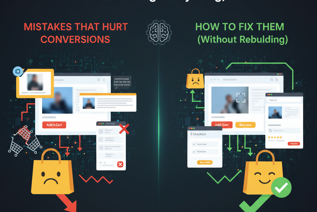
The good news is this: fixing these mistakes doesn’t always require a full redesign. Often, it’s about clarity, simplicity, and empathy for the buyer.
When a website feels effortless to use, people don’t notice the design at all.
They just buy.
And that’s the point.
If you’re seeing traffic but not conversions, the issue usually isn’t effort — it’s execution. Ecommerce websites don’t fail because founders don’t try hard enough; they fail because small design and experience gaps quietly push buyers away. At Eccommate, we help brands fix those gaps by building conversion-focused ecommerce websites that balance design, clarity, and trust — whether you’re launching fresh or improving what you already have. If you want a website that actually supports your growth instead of holding it back, explore our ecommerce services here.
If you’d like to see even more examples of common design pitfalls that directly hurt conversions, WebStacks has a great breakdown of critical website design mistakes — from slow loading speeds and confusing navigation to non‑responsive layouts that frustrate users and drive them away. Reading those insights alongside this post can help you spot hidden blockers on your own site and begin fixing them in ways that boost engagement and sales.


