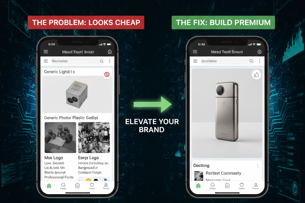
This is for ecom sellers who suspect their brand might be part of the conversion problem, but aren’t sure how to articulate what’s wrong or where to start fixing it. The good news is that “looking cheap” is almost never a talent problem or a budget problem. It’s a clarity problem, and clarity is fixable. This guide will tell you how to fix it.
The Pattern That’s Hard to Unsee Once You Notice It
Spend a few minutes scrolling through ecom brands like, Amazon listings, Etsy shops, Instagram ads, or a random sample of Shopify stores, and a pattern starts to emerge that’s uncomfortable once you start looking for it: a large proportion of ecommerce brands look cheap, even when the underlying product is genuinely good.
The signals are recognizable once you know what to look for. Logos that feel like placeholder text rather than a considered identity. Product photography that’s technically in focus but somehow still feels off — too harsh, too cluttered, too generic. Color choices that seem to have been made independently for the logo, the packaging, and the website, with no coordination between them. Packaging that does its functional job and nothing else. Websites that feel like they were built quickly, with the urgency of getting something live taking priority over how it would actually feel to a visitor.
None of these things, individually, would necessarily sink a business. But buyers don’t process a brand element by element, consciously evaluating each one. They process the whole impression, instantly and largely unconsciously — and that impression either says “this is a considered, trustworthy business” or it says something vaguer and less favorable, something closer to “something about this feels off, though I couldn’t tell you exactly what.”
That second reaction — vague, unconscious, but real — is what “looking cheap” actually means in commercial terms. It’s not a description of price point. It’s a description of the confidence, clarity, and trust a brand projects, or fails to project, in the first few seconds of contact. And because purchase decisions are driven substantially by that initial emotional read before any rational evaluation begins, a brand that looks cheap is fighting an uphill battle before a single feature or benefit has been communicated.
This piece is about understanding precisely what creates that impression, why it happens to so many genuinely good businesses, and — more usefully — how to fix it, and what specifically changes when it gets fixed.
“Cheap” Is a Trust Signal, Not a Price Signal
The first and most important reframe is separating “cheap-looking” from “cheap” in the literal sense. A brand can be selling a premium-priced product and still look cheap. A brand can be selling an inexpensive product and look entirely credible. The visual impression and the price point are related to each other only through the choices a business makes — they’re not the same thing, and conflating them is where a lot of misdirected effort comes from.
What “looking cheap” actually communicates is a set of unconscious signals about whether a brand knows what it is, whether its presentation reflects deliberate decisions or arbitrary ones, and whether the experience of buying from it is likely to be safe and satisfying or uncertain and risky.
Human perception is built around pattern recognition, and brand perception is no exception. When someone encounters a brand for the first time, they’re rapidly — and largely unconsciously — answering questions like: does this feel like it was made by people who know their category? Does the visual presentation feel intentional, like every element was chosen for a reason, or does it feel assembled, like elements were added as needed without much coordination? Does this feel like the kind of business that would handle a problem well if something went wrong? Would I feel good about this purchase a week from now, or might I feel like I should have looked elsewhere?
When the visual answers to these questions are uncertain — when nothing about the presentation actively signals “no, wait, this is fine” — the brain doesn’t proceed with confidence. It hesitates. And that hesitation, even when it’s brief and the buyer couldn’t articulate why it happened, is enough to measurably affect conversion rate, price sensitivity, and the willingness to take a chance on a brand the buyer hasn’t encountered before.
Research on how users form first impressions of websites shows that these judgments form within milliseconds — faster than conscious evaluation can begin — which is precisely why visual coherence affects conversion rate in ways that can’t be fully compensated for by strong copy or competitive pricing alone.
This is why fixing a “cheap” impression isn’t primarily about spending more money on design. It’s about closing the gap between “this looks like it was assembled” and “this looks like it was decided.” That gap can exist at any price point, and closing it doesn’t require a budget that matches premium competitors — it requires the kind of coherence that signals intention, regardless of how much was spent achieving it.
The Specific Patterns That Create a Cheap Impression
Understanding the abstract principle — coherence versus arbitrariness — is useful, but it becomes actionable when connected to the specific, recognizable patterns that show up across ecommerce brands constantly. Six patterns in particular account for most of the “cheap” impression that affects otherwise solid businesses.
Pattern One: A Logo and Colors Instead of an Identity
The most common starting point for a new ecommerce brand looks something like this: a logo gets created — sometimes through a freelance designer, sometimes through an automated logo generator, sometimes by a friend with design software — a color or two gets chosen because they look nice together, and a font gets selected from whatever’s available in the tools being used. These elements exist. They get applied to the website, the packaging, the social media profiles.
What’s missing from this process is any answer to the questions that should have come first: who is this brand actually for? What’s the specific problem it solves, and for whom specifically? Where does it sit on the spectrum from premium to value-focused, from playful to serious, from minimal to expressive? Why would someone choose this brand specifically, among the alternatives available to them?
Without answers to these questions, the visual elements that get chosen — the logo, the colors, the fonts — aren’t actually expressing anything. They’re just visual elements that happen to exist. And because they weren’t chosen in service of a specific identity, they tend to feel generic, interchangeable, and ultimately forgettable — which is a different problem from “ugly,” and often a more damaging one, because it’s harder to notice and therefore harder to fix.
The fix here isn’t more design work in the conventional sense — more logo iterations, more color exploration. It’s answering the identity questions first, and then making (or revisiting) design decisions in light of those answers. A simple logo and a restrained color palette, chosen because they genuinely express “this brand is for people who value straightforward reliability over flashiness,” reads as considered and intentional in a way that a more elaborate but identity-less design never will, regardless of how much time went into it.
Pattern Two: Logos That Either Try Too Hard or Don’t Try at All
Logo design specifically tends to fail in one of two opposite directions, and both produce the same underlying impression of not-quite-rightness.
On one end, overdesigned logos pack in gradients, drop shadows, multiple colors, intricate icons, and sometimes an attempt to visually represent the entire business concept in a single mark. The intention is usually to look impressive or sophisticated, but the effect — particularly at small sizes, where most logo encounters actually happen — is often visual noise. A logo that needs to be large to be legible, or that loses its detail and becomes a blur at thumbnail size, is failing at the most basic functional requirement of a logo, regardless of how elaborate it looks at full size.
On the other end, underdesigned logos are essentially just the business name in a default or readily-available font, sometimes with a generic icon placed beside it with no particular relationship to the typography. This isn’t really a design decision so much as the absence of one — and it reads that way, even if the viewer can’t articulate exactly why something feels unfinished.
The logos that work best for ecom brands tend to sit deliberately in the middle: simple enough to remain legible and recognizable at small sizes — a thumbnail on Amazon, a favicon, a social media profile picture — but considered enough that the typography, any icon element, and the overall composition feel like they were chosen together rather than assembled from convenient pieces. A logo’s job isn’t to explain the entire brand story in one image. Its job is to be recognizable, to anchor the visual identity, and to not actively work against the impression the rest of the brand is trying to create.
Pattern Three: Visual Inconsistency Across Touchpoints
This might be the single most common — and most quietly damaging — pattern, because it doesn’t require any individual element to be bad. It requires only that the elements don’t match each other.
The pattern looks like this: product photography on the marketplace listing uses one visual style — say, bright and high-contrast. The brand’s Instagram uses a different palette and a different photographic mood — moodier, more muted. The website uses yet another set of fonts than either of those, chosen separately when the website was built. The physical packaging, designed at a different time by a different person, doesn’t visually relate to any of the above.
No customer consciously catalogs these differences and concludes “this brand lacks a unified visual system.” What they experience instead is a vague, hard-to-articulate sense that something doesn’t quite add up — that the different touchpoints don’t feel like they belong to the same entity. And because that feeling is unconscious, it doesn’t get resolved by the customer thinking it through; it just sits there as low-grade unease, which translates into reduced confidence at exactly the moments — checkout, account creation, repeat purchase — where confidence matters most.
Consistency, by contrast, does something powerful precisely because it’s also unconscious: when the same colors, the same photographic style, the same typography, and the same tone show up everywhere a customer encounters the brand, it creates a cumulative impression of a single, coordinated entity — which reads as professional, which reads as reliable, which reads as safe to do business with. None of these inferences are explicit. They happen automatically, as a byproduct of consistency itself.
There’s a structural parallel worth noting here for sellers thinking about their broader online presence: the same kind of fragmentation that creates visual inconsistency across touchpoints can show up in content and SEO strategy too — different pages or listings inadvertently targeting overlapping search terms, working against each other rather than building a unified presence. Both problems stem from the same root cause: different elements created at different times, without a shared plan connecting them. Addressing visual consistency and addressing structural consistency in content are different tasks, but they come from recognizing the same underlying issue.
Pattern Four: Product Photography That Customers Can Tell Is Generic
Product images do more to influence a purchase decision than almost any other single element of a listing or website, and they’re also one of the places where “cheap” signals show up most directly and most damagingly.
The specific failures are familiar: harsh, uneven lighting that makes a product look less appealing than it is in person. Cluttered or busy backgrounds that compete with the product for attention. Inconsistent angles or framing across a set of images, making the product feel less coherently presented. Heavy editing that creates an uncanny, over-processed look. And perhaps most damaging — lifestyle photography that’s instantly recognizable as generic stock imagery, disconnected from the actual product or an authentic use context.
That last one deserves particular attention because customers have become remarkably good at detecting it, even if they couldn’t explain how. Stock photography has a recognizable quality — too polished, too generic, populated by people whose relationship to the product feels staged rather than real. When a customer registers, even unconsciously, that a “lifestyle” image isn’t actually showing this product being used by anyone real, the trust that image was meant to build doesn’t just fail to form — it can actively backfire, planting a small seed of “this brand isn’t being straightforward with me.”
The standard that good product photography needs to meet isn’t cinematic or expensive — it’s clear, honest, and consistent. Clear: the product is well-lit, in focus, and easy to understand from the image alone. Honest: what’s shown is genuinely representative of what arrives, including in any lifestyle or context shots. Consistent: the same lighting approach, the same general style, applied across the full set of images for a product and ideally across products within the same brand. Clarity and honesty consistently outperform attempts at polish that don’t deliver on either.
Pattern Five: Packaging Treated as a Shipping Requirement
For a substantial number of ecommerce businesses, packaging exists purely to fulfill its minimum functional requirement: get the product from point A to point B without damage. Beyond that, no thought goes into it — whatever box or bag is cheapest and adequate gets used, with no branding, no design consideration, nothing beyond the functional minimum.
The problem with this approach is that packaging is one of the only moments in an entire ecommerce relationship where the customer has a physical, tactile interaction with the brand. Everything else — browsing, reading, deciding, paying — happens on a screen. The unboxing moment is different: it’s physical, it’s often slower and more attentive than the browsing experience, and it’s frequently the moment a customer forms their lasting impression of whether this purchase felt like a good decision.
Packaging that communicates nothing — that’s purely functional, with no design thought applied — communicates something anyway, just not anything the brand would choose: it communicates that this purchase was a transaction rather than an experience, that the brand didn’t think about this moment, and by extension, that the brand’s attention to detail might not extend much further than the bare minimum required.
Packaging that’s been thought about — even modestly, even inexpensively — communicates the opposite: that someone considered this moment, that the brand cares about the experience beyond just the sale, and that the same attention likely extends to the product itself. None of this requires elaborate or expensive packaging. It requires intentional typography, thoughtful use of space, consistent application of the brand’s established colors and visual identity, and perhaps a small, genuine touch — a note, a thank-you, something that feels considered rather than templated. The cost difference between thoughtless and thoughtful packaging is often minimal. The impression difference is not.
Pattern Six: Websites That Feel Rushed
A website is frequently the first place a curious customer goes to validate a brand they’ve encountered elsewhere — on a marketplace, in an ad, through a recommendation. What they find there either confirms or undermines whatever positive impression brought them there in the first place.
Websites that feel rushed share recognizable characteristics: too many fonts used inconsistently across pages, color choices that don’t seem to follow any system, popups that interrupt before a visitor has had a chance to orient themselves, unclear visual hierarchy that leaves a visitor unsure what’s most important on a page, navigation that requires effort to understand, and walls of text that nobody — reasonably — is going to read.
The cumulative effect of these issues is a feeling of clutter and, more specifically, a feeling that mirrors the “cheap” impression discussed throughout this piece: a sense that the site was assembled under time pressure, without much consideration for how it would feel to actually use, rather than designed with the visitor’s experience as the primary consideration.
The websites that feel like the opposite — calm, clear, easy to navigate, with restraint in their use of color, typography, and competing calls to action — communicate confidence. A calm website doesn’t need to convince a visitor of anything through volume or urgency; it simply presents what it has clearly enough that the visitor can evaluate it on its merits. That calm is itself a trust signal: brands that don’t feel like they’re working hard to convince you of something tend to feel more credible than brands that do.
Why This Is a Revenue Problem, Not Just an Aesthetic One
It would be easy to file everything above under “nice to have, eventually, budget permitting” — important for brand perception in some abstract sense, but not urgent compared to product sourcing, advertising, or operations. That framing significantly understates what’s actually at stake, because the effects of a cheap-looking brand extend well beyond a vague sense of “looking less polished than competitors.”
Brands that read as low-trust find themselves competing primarily on price, because price is one of the few differentiators left when a brand hasn’t established any other reason to be chosen. This creates a structural disadvantage: price competition compresses margins, and compressed margins limit the ability to invest in the very things — quality, service, the brand experience itself — that would allow escaping price competition in the first place. It’s a self-reinforcing loop that’s difficult to exit once established.
Low-trust brands also tend to attract a different kind of customer than high-trust brands — customers who are more price-sensitive, more likely to be disappointed relative to their (often uncertain) expectations, more likely to request refunds or returns, and less likely to become repeat customers regardless of whether the product itself performed well.
Research on brand consistency and business performance, including Lucidpress’s widely cited study on the revenue impact of consistent branding, shows that brands presenting consistently across channels generate measurably more revenue than those that don’t, with the gap attributable directly to the trust and recognition that consistency builds over time.
This isn’t because the customers are different people in some fundamental sense — it’s because the brand’s presentation shaped what kind of expectations and what kind of relationship the customer entered with, and those expectations affect everything downstream, including how the customer interprets their actual experience with the product.
The review and reputation effects compound from there. Customers who arrived with uncertain trust and modest expectations are more likely to leave reviews that reflect that uncertainty — neutral at best, critical if anything about the experience didn’t exceed already-low expectations. Customers who arrived with confidence, because the brand’s presentation created it, are more likely to interpret the same product experience favorably, and more likely to leave reviews that reflect that favorable interpretation.
And because all of this affects conversion rate, advertising efficiency follows directly: a brand that converts better from the same traffic gets more value from the same advertising spend, can afford to bid more competitively while maintaining the same return, and accumulates the sales velocity that contributes to organic ranking improvements on top of everything else.
None of this is about aesthetics in the sense of looking nice for its own sake. It’s about the fact that visual presentation is one of the primary mechanisms through which trust gets established or fails to get established — and trust is one of the primary drivers of essentially every commercial metric that matters: conversion rate, price sensitivity, review quality, repeat purchase rate, and advertising efficiency. Branding, understood this way, isn’t decoration layered on top of the business. It’s one of the mechanisms the business runs on.
Fixing It: A Sequence That Doesn’t Require Starting Over
The encouraging part of all of this is that fixing a cheap impression rarely requires a complete overhaul, a large budget, or starting from scratch. It requires working through a sequence of decisions in the right order — because much of what creates a cheap impression is the result of decisions made in the wrong order, or not made at all, rather than decisions that were made badly with full information.
Step One: Decide What’s Actually Being Built
Before any visual work — before logos, before colors, before photography — the foundational question needs an answer: what kind of brand is this?
This isn’t a question with objectively right or wrong answers, but it is a question that needs a specific, committed answer rather than an attempt to be everything simultaneously. Is this a value-focused brand, where affordability and practicality are the core promise? A premium brand, where quality and experience justify a price above the category average? A practical, everyday brand that aims to be the reliable default choice without positioning itself as either luxury or budget? A specialist brand, narrowly focused on a specific niche or use case where deep expertise is the differentiator?
Each of these positions is viable. What’s not viable is trying to occupy more than one simultaneously — visual presentation that tries to look premium while messaging and pricing communicate value creates exactly the kind of incoherence that reads as “something doesn’t add up.” Similarly, a brand built around serious, technical credibility that adopts a playful, casual visual tone creates dissonance rather than appeal.
This decision doesn’t need to be elaborate or formally documented to be useful — it needs to be clear enough that it can actually guide the decisions that follow. “We’re the straightforward, no-nonsense option in a category full of overcomplicated alternatives” is a clear enough position to make logo, color, and copy decisions from. “We want to seem trustworthy and modern and also fun and also premium” isn’t — and brands that haven’t made this decision tend to produce visual identities that reflect that lack of decision, regardless of how much effort goes into the individual pieces.
Step Two: Build a Simple System, Not a Collection of Assets
Once the positioning is clear, the visual elements that express it should be built as a coordinated system rather than as independent assets created at different times for different purposes.
A workable system is genuinely simple: a primary logo and perhaps a simplified secondary version for small applications, two or three core colors that work together and that get used consistently rather than introducing new colors as needed, one or two typefaces — one for headings, perhaps a second for body text — used consistently across every touchpoint, a defined approach to photography and imagery (lighting style, composition approach, whether and how lifestyle imagery gets used), and a sense of tone for written communication — formal or casual, playful or serious, technical or accessible.
The value of having this system isn’t aesthetic sophistication for its own sake — it’s that it converts what would otherwise be a series of individual creative decisions, each made somewhat arbitrarily and each an opportunity for inconsistency, into applications of an established system. Choosing a color for a new product’s packaging isn’t a creative decision anymore; it’s selecting from the two or three colors the system already defines. This isn’t limiting in a way that stifles the brand — it’s the mechanism through which consistency, and the trust consistency creates, actually gets achieved.
Step Three: Upgrade Photography With Focus, Not Volume
Improving product photography doesn’t require dozens of images per product — it requires the right handful, executed well and consistently.
The useful set typically includes a clean hero image that clearly shows the product against a simple background, one or more images that show specific features or details that matter for the purchase decision, lifestyle or context imagery that shows the product in genuine use — genuine being the operative word, since the alternative is the stock-photo problem discussed earlier — and consistent lighting and framing across all of these, so the set feels like a coordinated presentation rather than a collection of separately-taken photos.
This level of photography is achievable without professional studio setups in many cases — natural light, a simple background, and attention to consistency can produce images that read as considered and clear, which is the standard that matters more than technical polish for its own sake. The return on this investment tends to be unusually direct: better images measurably improve conversion rate and, by setting more accurate expectations, can reduce returns — a combination that’s relatively rare in marketing investments, most of which affect only one side of that equation.
Step Four: Simplify the Website by Removing, Not Adding
For most websites that feel rushed or cluttered, the fix involves removing more than it involves adding. Excess fonts get reduced to the one or two the brand system defines. Colors outside the established palette get removed or replaced. Popups get reconsidered — is this interruption actually serving the visitor, or is it serving an internal goal (email capture, a promotion) at the cost of the visitor’s experience in the moment they arrive? Navigation gets simplified to what’s actually needed for visitors to find what they’re looking for, rather than reflecting every category the business has ever wanted to highlight.
The questions worth asking about every page: is it immediately obvious what’s being sold? Is it clear why it’s worth buying — what makes this option valuable? Is the next step obvious — does the visitor know what to do if they’re interested?
Whitespace — empty space that isn’t filled with additional content, images, or messaging — often feels, to people building a website, like wasted opportunity. From a visitor’s perspective, it reads as the opposite: confidence. A page that doesn’t feel the need to fill every available pixel with something feels considered and calm in a way that a dense, busy page doesn’t, regardless of how much individually-useful information the busy page contains.
Step Five: Treat Packaging as Part of the Brand, Not Separate From It
The final piece is bringing packaging into the same system as everything else, rather than treating it as a separate, purely functional decision made independently.
This doesn’t require premium materials or significant cost increases in most cases. It requires applying the established typography, colors, and tone to whatever packaging is already being used — a simple mailer or box becomes part of the coordinated brand experience when it uses the same visual language as the website and product images, rather than looking like it belongs to an unrelated business. A small additional touch — thoughtful spacing, a brief and genuine message, consistent use of the brand’s established visual identity — extends the considered impression into the one moment of the relationship that’s physical rather than digital.
The Shift That Actually Changes the Trajectory
Underlying all of the specific fixes is a broader shift in how the business relates to its own presentation — a shift from optimizing for getting something to market quickly toward building something that creates a lasting impression.
Products, by their nature, are replaceable — there’s very likely another seller, possibly several, offering something functionally similar, sourced from a similar or identical supplier. What’s not replaceable in the same way is the experience a brand creates — the cumulative impression formed across every touchpoint, the trust that impression builds or fails to build, and the recognition and preference that accumulate when that impression is positive and consistent over time.
Brands that prioritize speed to market above coherence tend to launch faster but plateau faster too — without the trust signals that drive conversion, repeat purchase, and word-of-mouth, growth depends entirely on continuously acquiring new customers through advertising, with no compounding advantage building underneath. Brands that invest in coherence — even modestly, even incrementally — build something that compounds: each positive interaction reinforces the impression that future interactions will also be positive, and that accumulated trust becomes an asset that advertising alone can’t replicate and that competitors can’t simply copy by sourcing the same product.
Frequently Asked Questions About Fixing a “Cheap” Brand Impression
How much does it typically cost to fix these issues?
Significantly less than most sellers expect, because the core fixes are about decisions and consistency rather than expensive custom work. Defining a brand position, narrowing to two or three colors and one or two fonts, and applying them consistently costs nothing beyond the time required to make and document the decisions. Photography improvements can range from minimal cost (using natural light and a simple setup with attention to consistency) to moderate cost (a few hours with a photographer focused on a specific, limited shot list). Packaging improvements often involve applying existing brand assets to packaging that’s already being used, rather than switching to more expensive materials.
Should this be done all at once, or can it be phased?
Phasing is not just acceptable but often more practical. The foundational step — deciding on positioning and defining a simple visual system — should happen first, because it informs everything else. After that, applying the system to the highest-impact touchpoints first (typically product photography and the primary sales listing or website) tends to produce the most noticeable improvement relative to effort, with packaging, social media, and lower-traffic pages following as time and resources allow.
What if the product itself is genuinely premium — does branding matter as much?
It matters more, not less. A genuinely premium product presented through a brand that reads as cheap creates a specific kind of dissonance — the product’s actual quality has to overcome an initial impression that suggests otherwise, which is a harder sell than a product whose presentation matches its actual quality from the first impression. Premium products benefit disproportionately from presentation that signals premium positioning clearly and consistently, because the gap between expectation and reality (in either direction) affects how the product performs once purchased.
Is it possible to over-invest in branding relative to product quality?
Yes, and this is worth being honest about. Branding that creates expectations the product can’t meet produces disappointment, returns, and negative reviews — arguably a worse outcome than under-branding, because it actively damages trust rather than simply failing to build it. The goal isn’t branding that overstates the product; it’s branding that accurately and clearly communicates what the product actually is and who it’s actually for, presented with the coherence and intentionality that builds trust in that communication.
How long does it take to see the effects of fixing these issues?
Some effects are close to immediate, improved product photography, for instance, can affect conversion rate as soon as updated images go live, since it directly affects the moment-to-moment decision-making of visitors encountering the listing. Other effects, the accumulated impression of consistency across touchpoints, the trust that builds through repeated positive encounters with a coherent brand, develop over a longer period, as more customers encounter the improved presentation across more touchpoints over time. Both timelines are real, and both matter; the immediate effects provide validation that the changes are working, while the longer-term effects are where the larger value accumulates.
Final Thought: Looking Cheap Is a Solvable Problem for Ecom Brands, Not an Identity
If any of the patterns described here feel uncomfortably familiar, that discomfort isn’t a verdict on the business or the people running it. It’s an extremely common situation, arrived at through an extremely common path: launching quickly, making individual decisions as they became necessary, and not pausing to step back and ask whether those decisions, taken together, were creating the impression intended.
The fix isn’t more talent, more budget, or starting over. It’s the sequence described above: deciding clearly what the brand actually is, building a simple system that expresses that decision consistently, and then applying that system across the touchpoints — photography, website, packaging — where customers actually form their impressions.
What changes when this work gets done isn’t usually dramatic or sudden. It’s the same product, the same price, sometimes even mostly the same assets, reorganized around coherence rather than arbitrariness — and that coherence is what allows the actual quality of the product to register, rather than being undermined by a presentation that was quietly working against it.
In a meaningful sense, a business that’s gone through this process is a different business afterward — not because anything about what it sells has changed, but because the relationship between that business and the people encountering it has changed. That difference shows up exactly where it matters: in whether people trust what they’re looking at enough to buy it, and whether they come back.
If you’re looking at your own brand and recognizing some of these patterns, and want help working through this sequence for your specific business, you can explore how we approach branding and visual identity at ecommate.co.uk.